
The 2024 Olympics
August 14, 2024
Let’s talk relatable experiences. Do you ever catch yourself at a restaurant, more focused on critiquing the menu’s layout than on picking what to eat? Do you ever make it everyone else’s problem that the kerning is just a little too tight? That the images are printed way too pixelated?
Just me?
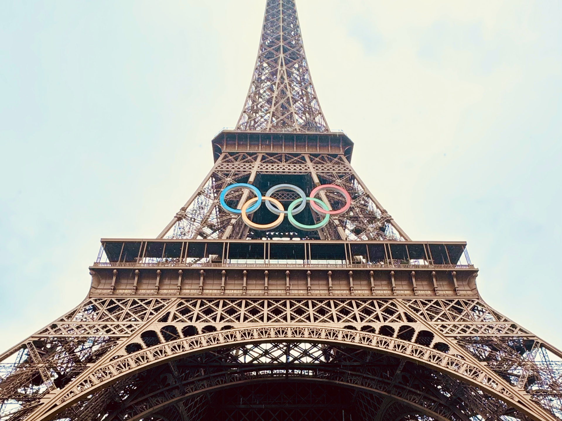
Well, as the 2024 Paris Olympics come to a close and the Paralympics take center stage, it’s time to debrief. I actually had the unique opportunity to experience the Paris Games in person this year! On a whim last summer, I decided to see if I could score tickets, and it turned out to be easier than I thought. Fast forward to last week, and there I was, a full-time brand designer, immersed in one of the biggest stages of world-class event design. You’d better believe I had some thoughts.
In the spirit of the Games, let’s hand out some medals, breaking down the design elements that truly shined and those that didn’t quite stick the landing.
Gold Medal: The Pictograms
To me, these were an absolute success. The clean, minimalist design of the pictograms perfectly balanced functionality with visual appeal. They weren’t just easy to understand—they animated beautifully, they were reminiscent of french art deco, and felt collectable. Above all else, they were completely fresh and unique. Each icon felt like a poster of the sport it represented, making them accessible for everyone, regardless of language or background. They weren’t just signs—they were symbols of the inclusivity the Olympics strive to represent.
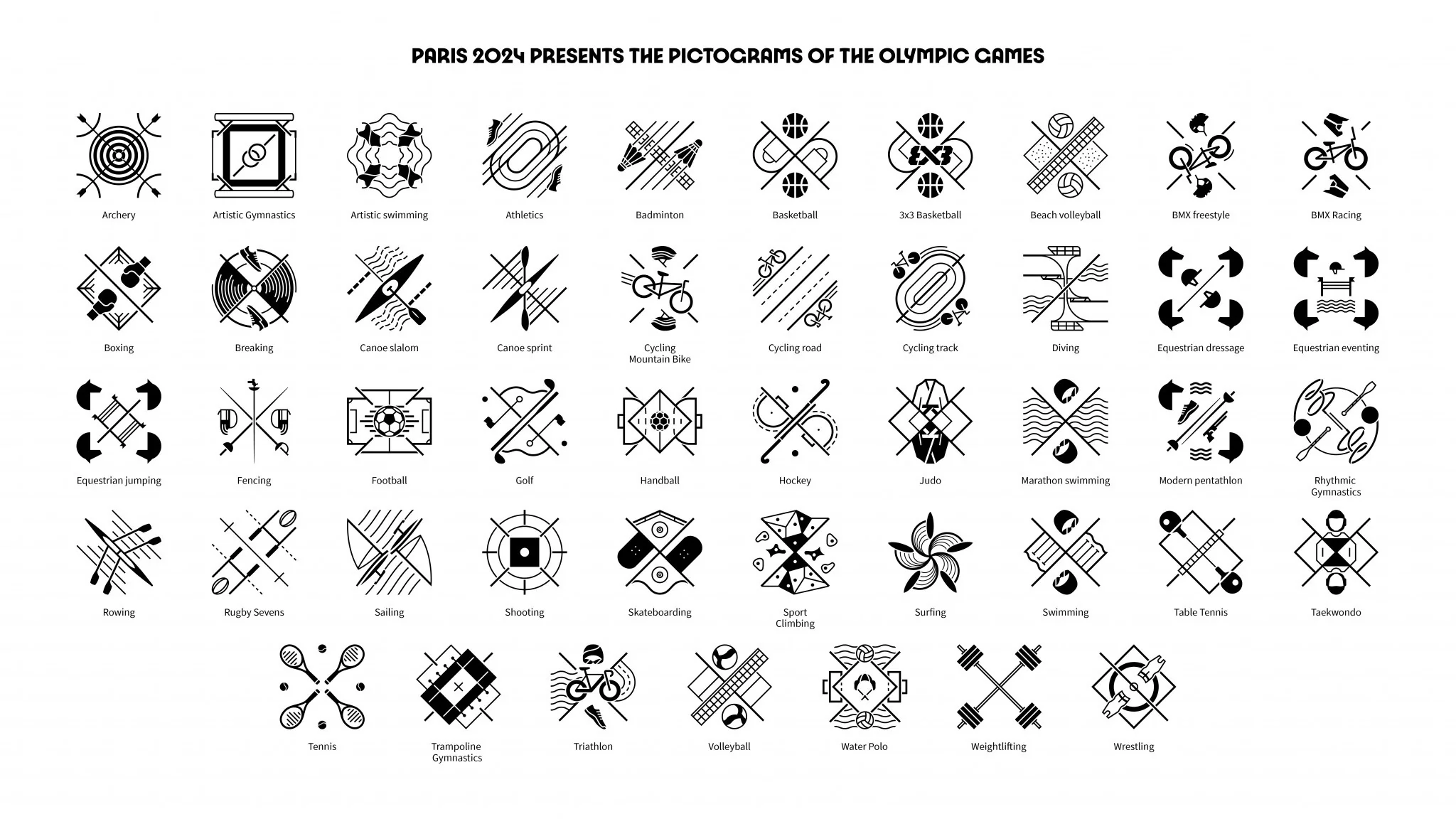
You might have noticed that the pictograms seemed a bit different this year. There was quite literally a lack of human representation, and that’s what I loved about them. According to Joachim Roncin, the event’s Head of Design, this intentional choice to depart from the human-modeled pictograms removes all gender biases from the sports. To put it frankly, the pictograms of previous Olympics can skew masculine depending on the viewer. I genuinely believe that by taking a completely new route with these pictograms, the standard of Olympic visual communication has been blown wide open.
What I love most about these pictograms, as a more personal preference, is the motion, energy, and intentionality of the layout. To me, these sports being depicted look like they’re being played. The courts, balls, horses, skateboards, etc., are in motion, and these pictograms are a snapshot of what it feels like to be in the audience. Absolutely brilliant!!
0’s Across the Board: The Olympics Merchandise
On the flip side, the official merch was a huge letdown. Designers and creatives know how important it is for products to evoke excitement and pride, but the offerings this year felt uninspired and lacking. I was really excited at the idea of bringing home a simple jacket that I could take with me to any Olympics watch party in the future, but sadly there was nothing really like that. There were lots of t-shirts with just this year’s logo printed on it, but that just felt so lame and a missed opportunity to create something fresh with this year’s branding. It was a harsh reminder that even the smallest details in branding can have a significant impact on the overall experience.
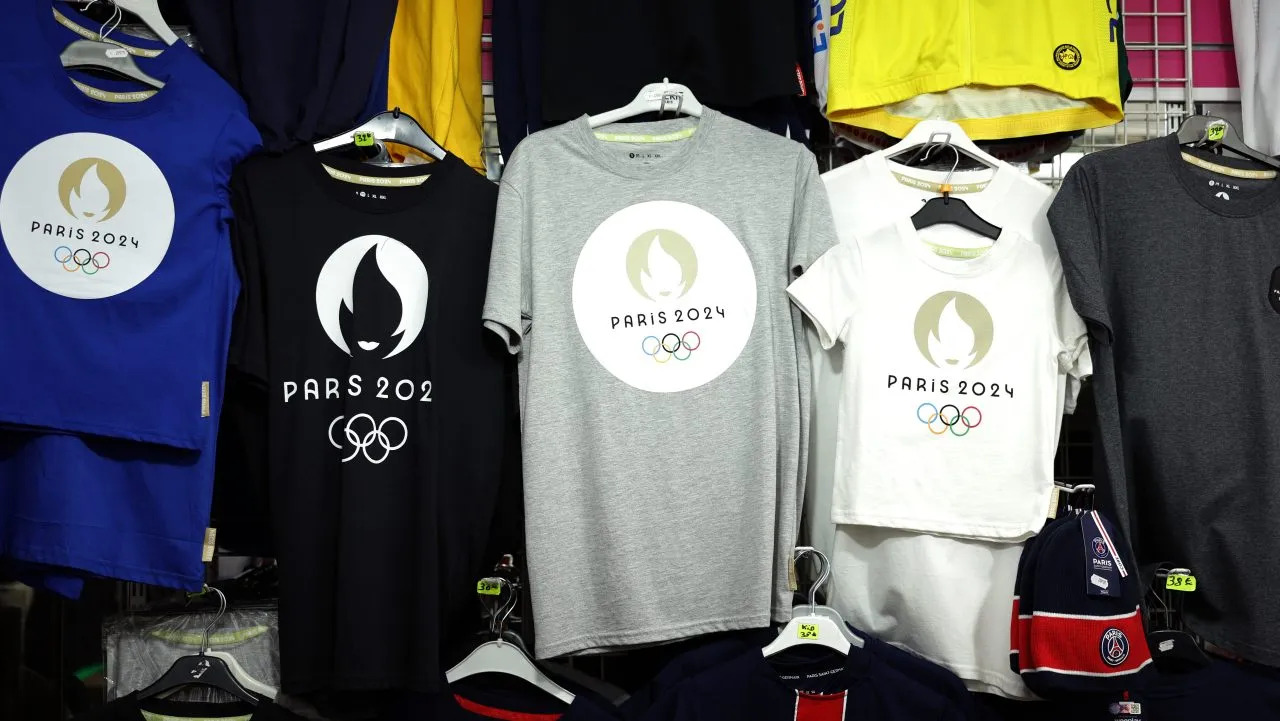
I will say, one of the coolest merch items was a deck of playing card that had the 2024 branding. It had custom artwork for the face cards which made it feel like a special item, and I just wish they had more items like that overall.
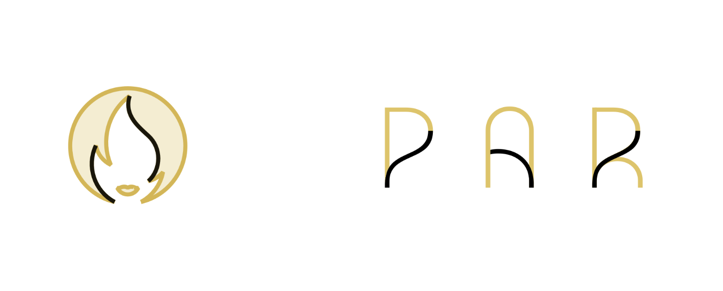
Silver Medal: The Logo
The Paris 2024 logo had its fair share of critics, but I found it to be a standout piece of branding. It was bold, distinct, and carried a modern elegance that perfectly represented Paris. The flame intertwined with the face of Marianne was a brilliant nod to both the host city and the spirit of the Games. It struck a balance between being visually compelling and functional—scalable across different mediums without losing its impact.
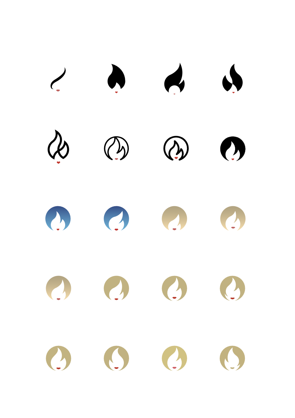
The logo was extremely prevalent throughout the city, showing up on signage and public transport everywhere. By the end of my week in Paris I was extremely familiarized with it. She even became a mark of safety for me; whenever I saw the logo I knew I was headed in the right direction. I also thought it was special that the Olympics and the Paralympics both used this same icon and overall branding this year, maintaining the same amount of hype and respect for all games.
Take a look at this interview by The Creative Factor of Logo designer “Sylvain Boyer: How I Designed the Paris Olympic Logo” for an in-depth read of the creation of this year’s logo!
MVP: The Typeface
The custom typeface was an unsung hero of this year’s branding. It was clean, versatile, and perfectly captured the essence of the event. Whether on tickets, signage, or digital platforms, the typeface was clear and consistent, adding a layer of sophistication to the visual identity. The Olympic energy is definitely felt in the curvatures of the letterforms, and I’m a huge fan of it! It’s a prime example of how typography, when done right, can elevate a brand’s entire aesthetic.
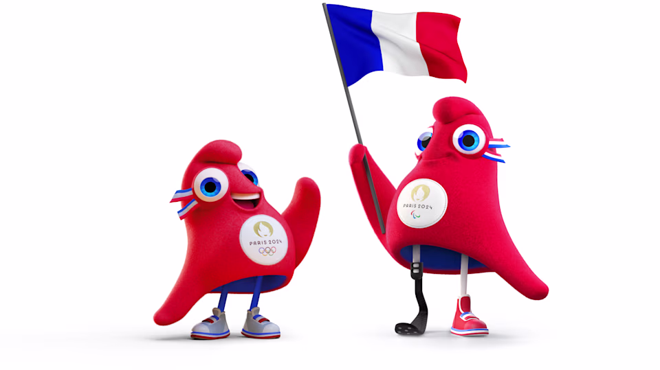
Bronze Medal: The Mascot
Let’s talk about the mascot—love it or hate it, it definitely made an impression. The Phryge, inspired by the iconic Phrygian cap, was cute, fun, and very French. It definitely brought a sense of playfulness to the Games, which is crucial for engaging younger audiences and adding a touch of character to the branding. However, I do recall being a big hater of Phryge when I first saw it. I initially thought the design felt disconnected from the event’s entire branding, but after some research into years previous it honestly made me like it a lot more.
The animated treatments and motion graphics that were displayed at the events elevated this part of the branding as well! Phryge had a playful personality and it was so adorable watching it demonstrate how each game is meant to be played. The fluid transitions and vibrant color palette made the digital experience feel alive and immersive. Motion design isn’t just about aesthetics—it’s about creating an experience, and I think it really payed off.
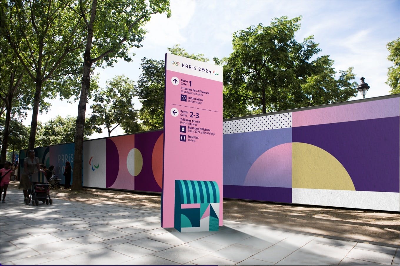
Special Shoutout to: The Wayfinding
Finally, let’s talk about wayfinding. The signage throughout the venues was clear and concise, which is no small feat given the scale of the event. It’s easy to overlook, but effective wayfinding is essential for a seamless visitor experience, making sure everyone can navigate the venues easily, even if they don’t speak french/english.
The Olympics always stir up strong opinions—every four years, there’s a lot to love and plenty to critique. This year’s branding took some bold risks, stepping away from traditional expectations to create something new for the world of the Olympics. But with risk comes the potential for missteps. Accessibility, functionality, visual appeal, and the ability to excite are all crucial elements of successful design, and the Paris 2024 Olympics gave us a lot to discuss.
So, what’s your take? How would you rank the design elements of this year’s Games? Were you blown away, or did it leave you wanting more? 🍵
