
.png)
Breaking the Grid
March 5, 2025
Digital design has been obsessed with getting things right for far too long—pixel-perfect grids, smooth gradients, rounded corners, and typography so meticulously kerned it could bring a typographer to tears. But lately, something’s changed. A new design movement is storming the web, breaking rules and questioning everything we thought was sacred.
Enter Brutalist and Anti-Design—two rebellious approaches throwing a wrench into the pristine, user-friendly world of digital interfaces. They reject perfection in favor of raw, unfiltered expression. Ugly? Sometimes. Hard to navigate? Often. But that’s precisely the point.
Brutalist design has nothing to do with being rude (unless you count aggressively bold typography). It takes inspiration from Brutalist architecture—think raw concrete, exposed beams, and a general "we don’t care if you think this is ugly" attitude. In digital spaces, it means stark contrasts, harsh edges, unstyled buttons, and an intentional lack of polish.
Remember Bloomberg’s 2016 site redesign? It was a shock to the system. Blocks of text, clashing colors, and layouts that felt like they were built on pure chaos. People hated it. People also couldn’t stop talking about it.
While Brutalism still technically follows the rules of usability, Anti-Design flips the whole table over. It thrives on discomfort—text that overlaps, misaligned elements, navigation that forces you to work to find what you’re looking for. It’s not about being user-friendly; it’s about making the user feel something.
A perfect example? Balenciaga’s website If you’ve ever visited, you probably wondered if you accidentally clicked a phishing link. It exemplifies Brutalist design with its minimalistic layouts, stark typography, and unpolished elements, reflecting the brand's bold and rebellious approach to fashion.
For years, digital design has followed the same formula. Clean, minimal, efficient. But when every brand starts looking the same, what’s left to stand out? Chaos. Aesthetic rebellion. The willingness to be wrong on purpose.
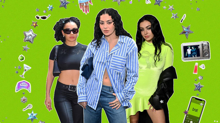
Lately, brands and artists have been running full speed toward this new wave of design anarchy. Charli XCX’s 2024 album Brat embraced blurry Arial text and a highlighter-green background that practically vibrates. Former Vice President Kamala Harris’ Kamala HQ borrowed from Charli XCX to bridge a generational-divide, that created a cultural vibe that felt more meme than political campaign.
And then there’s Chappell Roan’s "Good Luck, Babe!" music video, which looks like it was made entirely in PowerPoint—with Comic Sans, watermarked clip art, and transitions so stiff they’d make a middle school slideshow jealous.
Jaguar's radical rebranding and the unveiling of the Type 00 concept car showcased a bold departure from traditional automotive design, embracing brutalist aesthetics to provoke and engage audiences.
Not everyone loves it. Critics argue that these approaches sacrifice usability, accessibility, and common decency. And to be fair, they’re not wrong—navigating an Anti-Design website can feel like an escape room with no clues. But for brands looking to shake things up, it’s a breath of fresh air.
If you’re designing a hospital website, maybe don’t embrace Brutalism. But if you’re working on a creative portfolio, an album cover, or a campaign meant to make people stop scrolling—this might be exactly what you need.
For years, we’ve been obsessed with making digital design easier. Maybe it’s time to make it more provoking.
Until next time—keep breaking things (intentionally).
Peace!
%2520(1).png)