
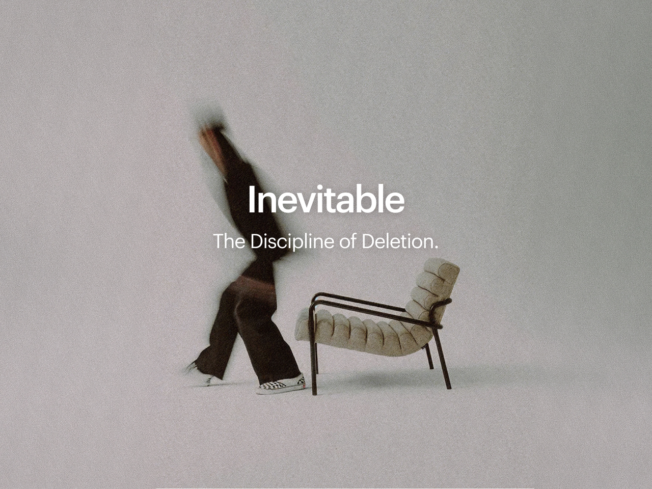
Inevitable
June 24, 2026
I see this moment in every project, and nobody puts it in the case study. It comes after the research, the moodboards, and the first round of concepts, when the wall is covered with things that are all fine individually. The logo is good. So is the type pairing, and the color story holds together without much argument. And the work is still sort of bad, in the specific way that a room full of nice furniture arranged badly is bad. You are not missing anything. You have too much.
What happens next is the part of the job that very few document, and it almost never looks like adding.
We talk a lotin this industry, about taste being the thing machines can't reach. Fine. But that framing makes it sound like a feeling, some inner sommelier you either have or you don't, when the part that actually separates work that lands from work that merely functions is more boring than that, and more learnable.
It is the willingness to take something good out of the room and find out whether the room improves.
Most people can't do it. Removing something you made hurts in a way that adding never does, and the hurt is what stops them, not some shortfall of taste.
Da Vinci gets quoted to death on this, the line about simplicity being the ultimate sophistication, which he may never have said. The version I trust came from Antoine de Saint-Exupery, who flew the planes he wrote about and understood what one rivet too many costs at altitude.
"Perfection, he wrote, is reached not when there is nothing left to add but when there is nothing left to take away."
He was talking about the aircraft. It survived the jump to design because it was never really about the aircraft. It is about the gap between something that is finished and something you just stopped working on.
This is what subtraction looks like when it is going well, because the principle is useless without the mechanics. You cut the second accent color, the one you were attached to, and the system suddenly reads as confident instead of anxious. You delete the clever tagline and discover the logo can carry the meaning alone, and it is stronger for not leaning on a sentence. You pull three weights out of the type scale, and the hierarchy gets clearer rather than poorer. You remove the gradient, and then the second gradient you had added to make the first one look deliberate. Every one of these is a small grief. Everyone is also in the moment; the work stops looking like fifteen decisions and starts looking like one.
That last word is the one we keep circling back to at the studio. When an identity is right, it carries a quality of having always existed, as though you found it rather than built it. Nobody looking at it counts the four hundred choices underneath. They just feel it could not have gone any other way.
What took me years to accept is that the feeling is manufactured almost entirely through deletion. You earn it by throwing out everything that made it complicated.
None of this got easier with better tools. The opposite, and the reason is worth understanding. Design Generation is nearly free now, and that sounds like a gift and behaves like a trap, because the bottleneck in good work was never making the options. It was choosing among them. When options were expensive, you committed early and refined. Now you can keep every door open indefinitely, and a lot of mediocre work is really just someone who couldn't bring themselves to shut a single one. More options don't deliver clarity. They make clarity the thing you now have to go find.
So the skill that matters has shifted from can you make it to can you give it up. Can you look at something competent, agree that it's competent, and cut it anyway because it isn't pulling its weight in the system? That is a muscle.
You build it the way you build any muscle: by doing the uncomfortable thing on purpose until it stops feeling like a reason to quit.
A few ways it develops in practice, since I distrust non-actionable advice.
Working to a constraint you didn't pick teaches it fastest: one color, type, and nothing else, a mark that has to survive being a centimeter wide. The limit does the cutting while your judgment catches up, and you learn what enough feels like by being refused more.
Another is to build the thing and then rebuild it from a near-blank canvas, keeping only the parts you genuinely missed while they were gone. You tend to miss less than you expect. And the one most people avoid: put the work in front of other people while it is still ugly. Not for reassurance. For the question you cannot ask yourself, where somebody points at the element you were privately proud of and admits they have no idea why it's there. Half the time they're wrong. The other half, they've located the thing you needed to delete, but couldn't see because you were too close to it and liked it too much.
That last one is why working in isolation silently rots your craft, and why we built a small studio the way we did. Office Hours happen daily, and work goes up before it is ready.
Our weekly connect sessions exist for the room, not the status report.
Engaging with people who will tell you the truth about a layout isn't a perk. Honestly, it is the infrastructure for an edit you cannot perform alone.
I'm thinking about all this now, partly because we're hiring, and crafting the role forced us to say plainly what we're after. We're bringing on an Identity Designer. The honest temptation with a job post is to list software and years, and we did, three to five years, Figma, the Adobe tools, the usual furniture. But the line we mean most is the one about caring as much about coherence as about craft, and understanding that good design is not about adding more but about distilling until a thing feels inevitable. That is the real role. We can teach plenty, but we have never managed to teach someone to enjoy taking the good idea out of the room, so we stopped trying, and we look instead for people who already know that particular satisfaction, the clean relief of work getting simpler and truer in the same motion.
If that's a feeling you recognize, the kind where your favorite part of finishing is the pile of things you decided not to keep, the post is on our site and here. Three months to start, with room to extend if the fit is real.
Everything starts small, we like to say, and people hear it as a line about scale.
That isn't quite it; it's an expression about reduction: refuse to add until the one thing that matters is impossible to miss, then strip the noise around it until it has no choice but to be heard. The work worth making rarely shows up looking complicated. It shows up looking obvious, which is about the hardest result there is to design, because obvious is what remains after you have found the discipline and the nerve to remove everything that wasn't it.
So take the good thing out of the room, and see what the room does without it. That has always been the work.
✌🏽
