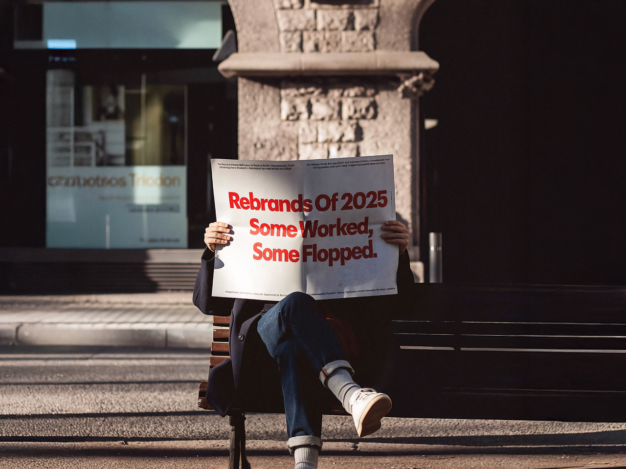
Rebrands of 2025
December 17, 2025
2025 isn't even technically over yet, and we've already witnessed some truly spectacular brand identity decisions. Some companies nailed it. Others should have saved the consulting fees and bought everyone bagels instead (not being mean).
Rebrands are odd things, and are never just about the logo. But more about whether a company understands what it actually is, who it's talking to, and whether anyone asked for this in the first place. Get it right, and you clarify decades of visual clutter into something people actually recognize. Get it wrong, and you've just set a pile of money on fire while your customers stage an intervention on Twitter (we still call it that, okay...okay, your purist, we meant X).
Let's look at some of what the year dragged in.
Homework well done
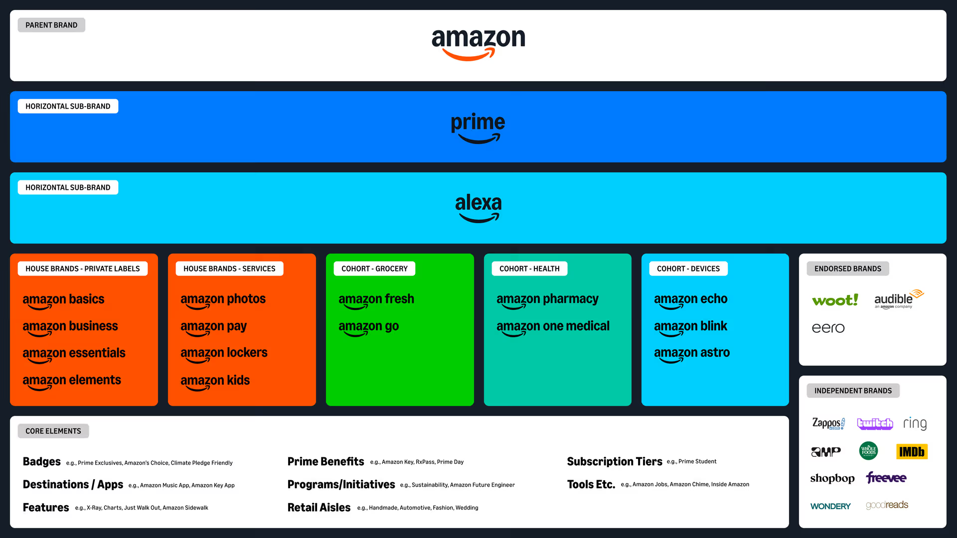
Amazon finally touched its logo after roughly 20 years of letting it ride. They softened the smile, cleaned up the typography, and built a color system that actually makes sense across their increasingly sprawling empire. This is the rare rebrand where the main achievement is that you barely noticed it happened. Everything feels more unified without Amazon suddenly looking like a different company. That's the goal. You want people squinting at the website going, "Did something change?" not "What fresh hell is this?"
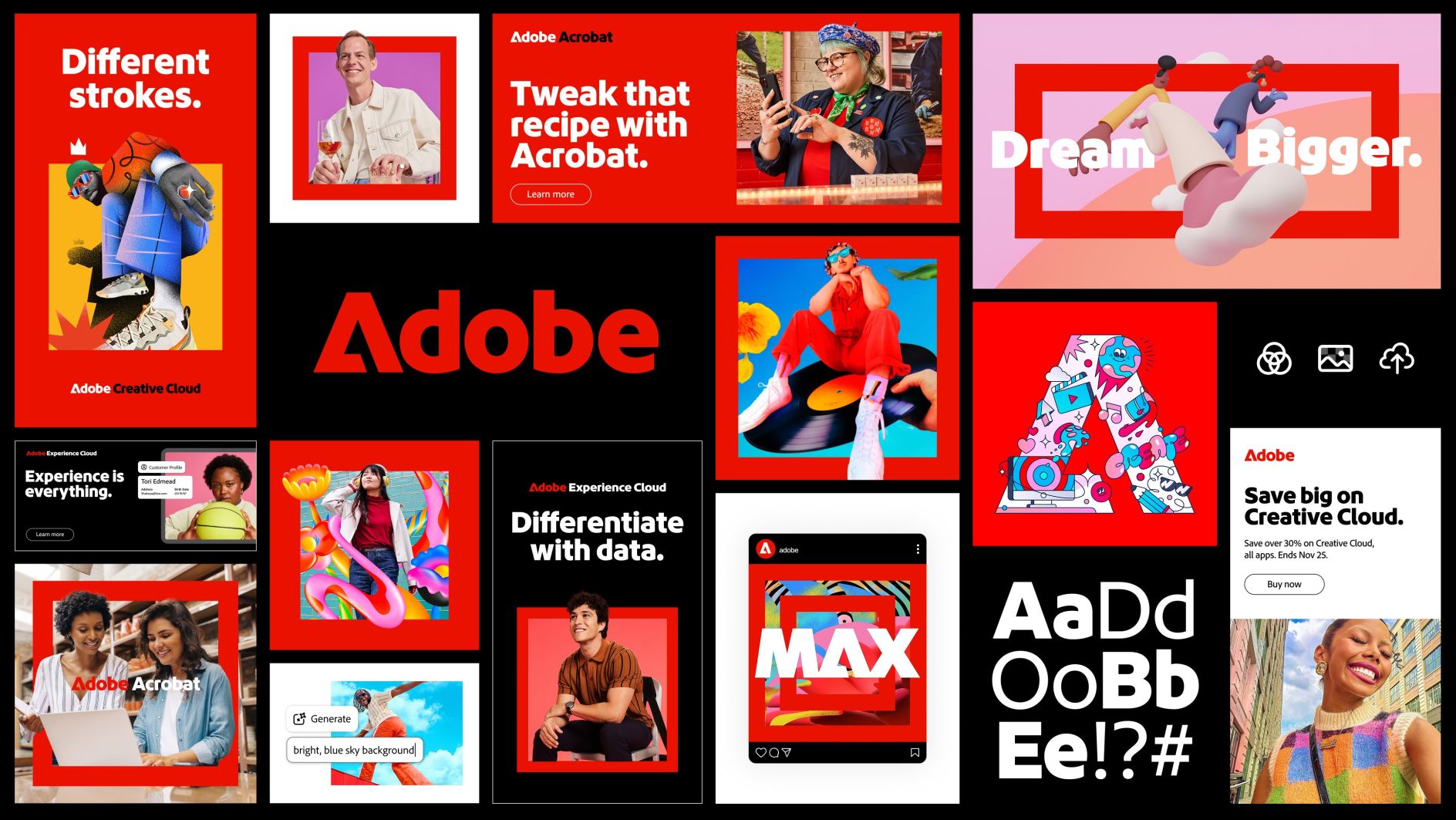
Adobe pulled off something similar in 2025 with what people are calling a "quiet but powerful" refresh. They unified their ecosystem with a tighter grid and a cleaner red system that works across Photoshop, Illustrator, Premiere, and the dozen other apps in their portfolio. It's the kind of move that respects decades of brand equity instead of torching it for the sake of looking new. When you're already a powerhouse with that much legacy and breadth, subtle evolution is smarter than a radical makeover. Adobe understood this. They didn't try to reinvent themselves; they just cleaned up the house they'd been living in for years. The rebrand looks good, but we still ride for Figma.
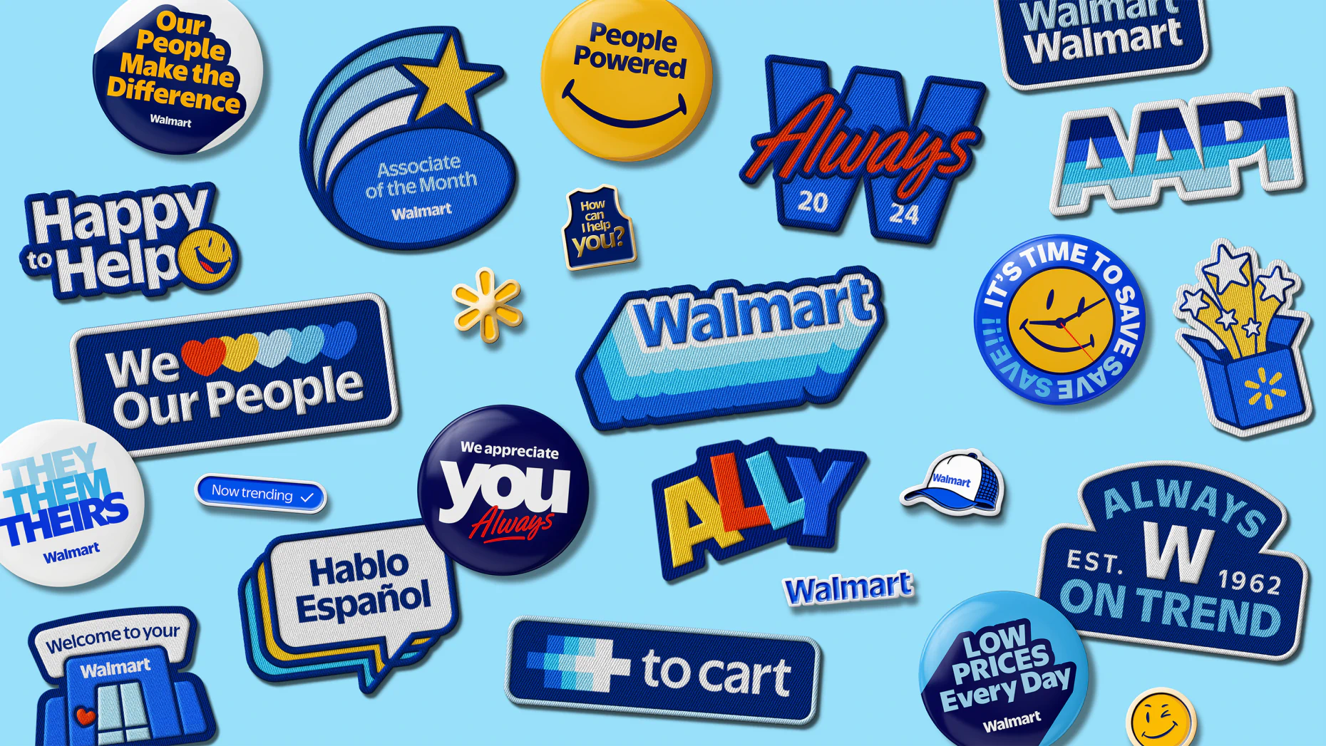
Walmart evolved its wordmark and that little spark symbol, tuned everything for a world where people shop in stores, online, at clinics, and see the logo on delivery vans. It's a series of small, precise adjustments that add up to something noticeably sharper and more confident. Nobody's writing think pieces about it, which means it worked.
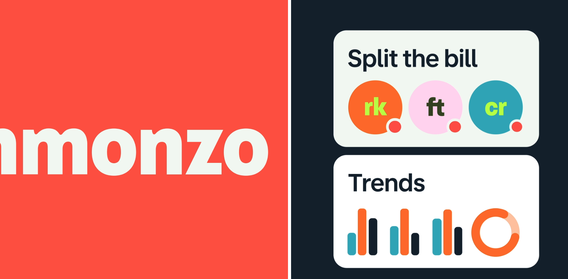
Monzo, the UK banking app, went hard into Gen Z territory with bold typography, pastel gradients, and a mobile-first UI that actually understands how people under 30 interact with money on their phones. They refreshed their entire experience to match who their emerging audience actually is. It works because they committed to the bit: if you're going after younger users who've never walked into a physical bank branch, you can't just slap a new font on the old system and call it done. You have to rethink everything from notifications to how someone splits a bill. Monzo did that.
Eventbrite completely reimagine what event discovery looks like. They built a new logo icon called "The Path" that's actually customizable for different communities (foodies, artists, plant people, whatever). The whole system is bright, animated, and social-first, which makes sense because that's how people actually find and share events now. The icon itself is satisfyingly squishy and dynamic, representing the journey from:
"I saw this thing" to "I have memories about this thing."
It's one of those rebrands where making the icon the hero actually works because it's flexible enough to mean something across wildly different contexts. The bold color palette and lifestyle photography capture that raw energy of being at a live event, which is exactly what you want people feeling when they're deciding whether to buy tickets.
.gif)
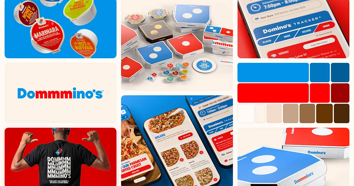
Domino's rolled out a new creative refresh that shows they're confident enough to evolve beyond their old, hard-hitting product identity. Instead of staying locked in the ‘we fixed the pizza’ narrative forever, they're experimenting with broader brand visual storytelling. In other words, they stretched their wings a bit, exploring emotional territory that most legacy brands tiptoe around. It’s a shift from pure product punchlines to a wider cultural identity. Think of it less as ‘generic brand purpose’ and more as Domino’s saying, ‘we know who we are now, so let’s play on a bigger stage with our logo.
The dog ate their Homework
And then we had the ones where some people started losing it on the internet.
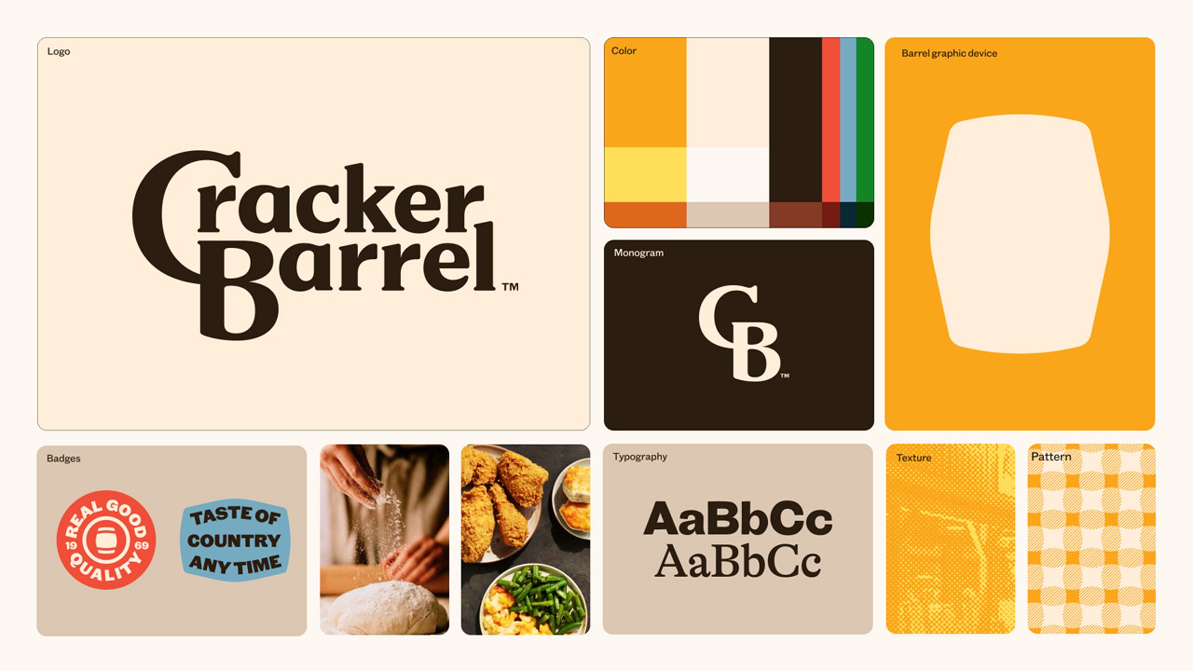
Cracker Barrel decided to modernize by stripping out its entire "Old Country Store" illustration and heritage language in favor of a generic text-only logo. Which is a bit like Dolly Parton showing up in a beige pantsuit and announcing she's rebranding as "D. Parton, Leadership Consultant." The backlash was immediate, fierce, and extremely online. Stock dropped about 10%, wiping out roughly $100 million in value. They reversed course so fast you could hear the tires screeching from space (a little over the top, we know).
The Cracker Barrel situation is a perfect case study in misunderstanding your own audience. The people eating biscuits and gravy at your restaurant are not asking for minimalism. They're there specifically because you look like a grandmother's living room exploded into a roadside gift shop. That's the whole appeal. Stripping it away doesn't make you modern; it makes you unrecognizable.
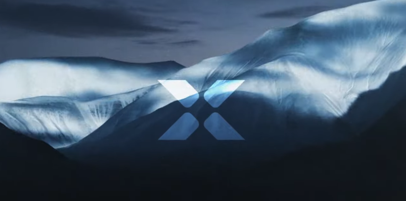
X Games sanded off all the subcultural, action-sports edge that made it distinctive and replaced it with something that looks like a generic corporate sporting event. The whole point of the X Games was attitude. It was supposed to feel dangerous and cool, not like something your HR department would sponsor. Removing that edge doesn't broaden your appeal; it just makes you forgettable.
OpenAI keeps making visual and narrative adjustments that aren't resonating with the disruptive impact of its product, mainly because they're happening amid trust debates and leadership chaos. The design might be fine, but the brand feels unstable. People are reading inconsistency as a signal that something's wrong internally, which it might be. You can't rebrand your way out of perception (on second thought, maybe you can for a while).
HBO Max is a special kind of yo-yo, because it's actually a ball in motion. Back in 2023, they rebranded from HBO Max to just "Max," which everyone hated. Now in 2025, they've reversed course and gone back to HBO Max, complete with that classic camera lens sitting in the O. The logo itself is actually good. It's timeless, cinematic, captures the nostalgic feeling of settling in to watch Friends for the nine hundredth time. The problem isn't the design; it's the flip-flopping.
When a brand can't commit to an identity for more than a couple years, it signals indecision at the executive level. You dilute recognition. You confuse people. You look like you don't know what you're doing (Yikes!). The HBO Max logo is perfect for what they are, but they need to stick with it for longer than it takes most people to finish a season of Succession. Especially now with the Netflix acquisition looming (or certain), pick a lane and stay in it.
What separates the Good from the others
The successful rebrands share a pattern: they're solving real problems. Amazon needed to unify a sprawling ecosystem. Adobe needed to align a complex portfolio without losing recognition. Walmart needed to work across channels. Monzo needed to speak the language of a generation that's never touched a checkbook (thank goodness!). Eventbrite needed to reflect the actual journey of discovering and experiencing events in a social-first world. These are strategic fixes with visual solutions that extend into actual experience.
The others that didn’t go down so well also share a different pattern: they're solving problems nobody had. Cracker Barrel wasn't struggling because its logo looked old. The X Games weren't losing viewers because they had too much personality. HBO Max wasn't struggling because people loved the name too much (though to be fair, they're now learning that lesson the hard way). These companies looked at their challenges and decided the brand identity was the issue, which is like rearranging deck chairs on the Titanic if the Titanic were also on fire and the chairs were made of dynamite (too far, we know).
The brands that succeeded were careful to evolve their identity on purpose rather than erase it (Amazon, Walmart). The ones that had people mad tried to delete their history in pursuit of something "modern," which is usually code for "we hired a consultant who showed us what everyone else is doing."
So, what’s the lesson 🤔
If you're thinking about a rebrand, ask yourself what problem you're actually solving. Is it a real problem or just boredom? Are you making something clearer or just different? Do your customers want this, or are you doing it because a consultant showed you a mood board?
Sometimes the answer is yes, you need a refresh. Your visual system is a mess. Your logo doesn't work at small sizes. You've outgrown what you started with. Fine. Do it thoughtfully, do it strategically, and for the love of God, do not erase the things that make people remember you.
And sometimes the answer is no, you're fine, the problem is somewhere else entirely, and maybe you should spend that rebrand budget on fixing your actual product or giving your team a raise.
Because at the end of the day, the visuals are a part of your identity. It can surely clarify what you already are. But it cannot turn you into something you're not. And if you're Cracker Barrel, it definitely cannot make you cool.
✌🏽.