
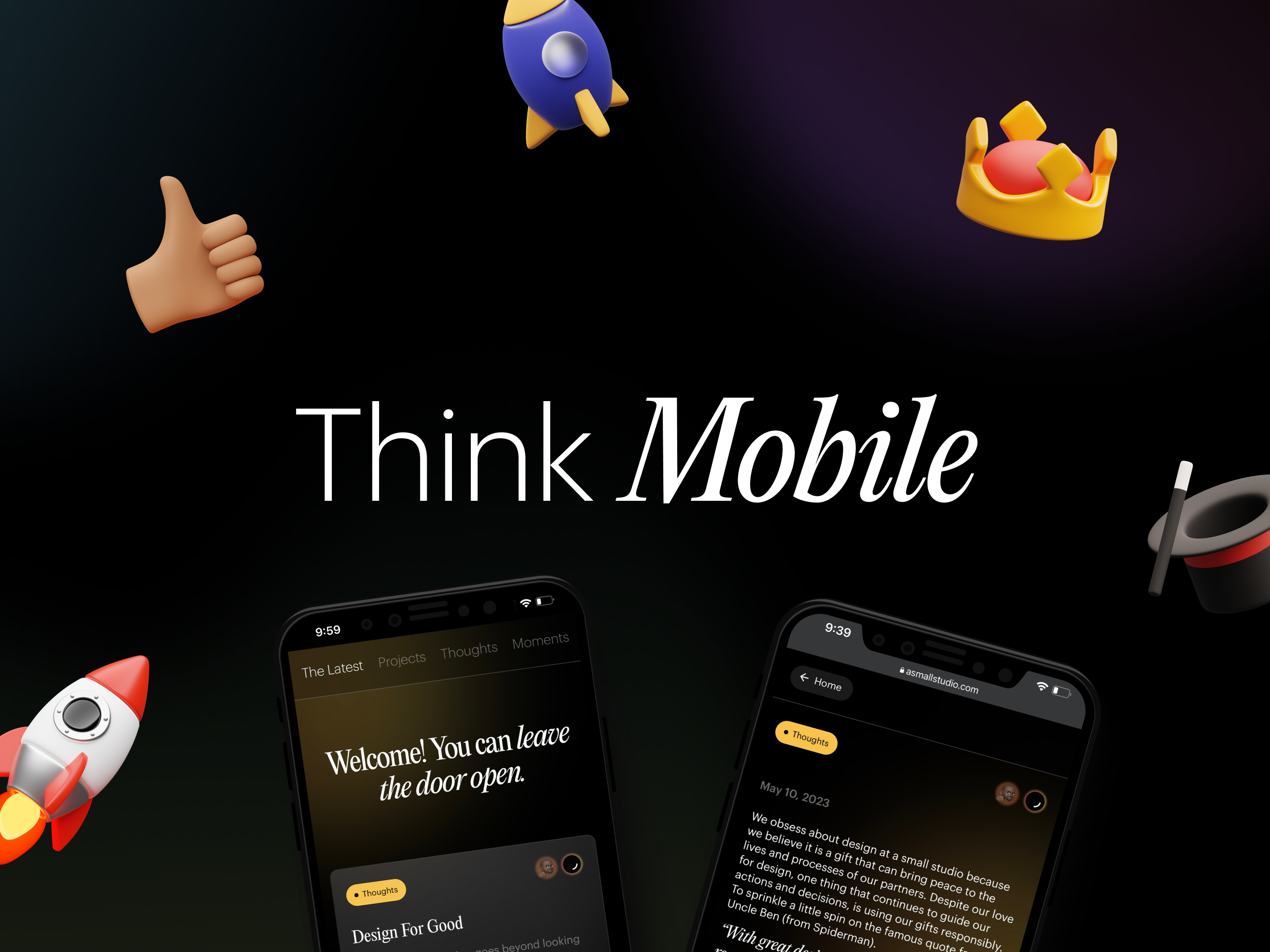
Think Mobile
May 17, 2023
Let's face it, the small screens are stealing the spotlight (Dear Designers, we know how much you love your big screens). We mean small screens from the point of user interaction/engagement with already designed platforms. Building with thumb-friendliness is critical to delivering the best experience for consumers.
Smartphones have become extensions of most of us, we’re now obsessed with swiping, tapping, and scrolling to seek new information or thrilling mobile experiences. As designers, we aim to build with the knowledge of this tectonic shift in user habits. We will highlight a few essential tips to keep in mind when designing for mobile;

Size Matters 📱
This is because users access the web through a wide range of devices. Each device comes with a different aspect ratio, screen size, resolution etc. which influence how the user experiences the product. Always keep the principle of responsive design in mind, create fluid layouts that rearrange content elements based on available screen real estate. Pixel-perfect brilliance is the goal across devices!
User Experience is 👑
Consider the ergonomics of user interaction because users navigate the mobile interface with their thumbs. With knowledge of this, essential elements such as navigation menus, interactive buttons should be placed in spots of easy thumb access. Leveraging the knowledge of how users interact with their devices; is how you build an intuitive sense of delight and engagement into your product.
Color is Powerful 🎨
Color choices hold immense power in influencing the overall look and feel of mobile design. Dive into color psychology to learn how different hues evoke emotions and vibes. Red and oranges are often used to elicit energy and excitement, while blues and greens evoke calmness and serenity. Being strategic with color is building magic into user engagement.
Speed Rules 🚀
Lightning-fast performance is often the expectation on mobile devices. So, designers have to optimize for this in different ways; like image compression, without compromising on quality (never take that for granted). Use lazy loading content elements to your advantage and minimize code bloat by removing redundant or unused code. Unnecessary codes often increase file size, reducing load time and affecting the user's experience.
These few points we’ve highlighted aren’t all but they can empower emerging designers as they execute on whatever project at hand. We hope we’ve inspired you to unlock more perspective on your Design journey.
See how we deployed everything we discussed for Peridot!

Keep the Creative sparks flying!