
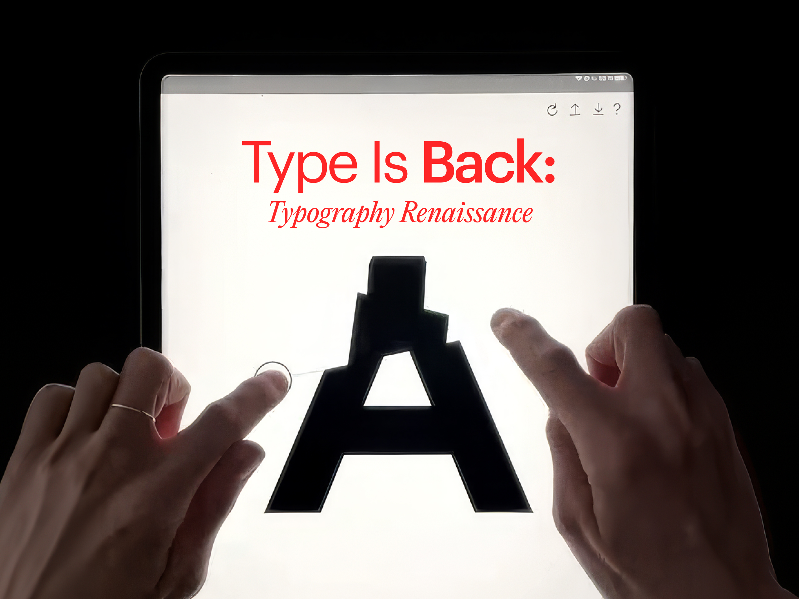
Type is Back
August 19, 2026
While machines flood the world with default everything, the people who draw letters by hand are having their best year in a decade.
In July, a designer published a typeface she started eleven years ago as a student at Reading University. Eleven years on a single alphabet, refined across a decade in which the industry around her decided that creative work should take eleven seconds. We can think of no purer inversion of prompt culture, and no better place to begin an argument we have been wanting to make:
Typography is being promoted from detail to infrastructure.
The evidence is piling up in unglamorous, structural ways. This month NaN, the foundry behind custom fonts for Deezer, Wise, and Channel 4, launched fonts.xyz, a distribution platform for independent type designers. The terms are the story: an 80 percent royalty cut to the designer, a unified all-inclusive license, an 80 percent student discount, and a 1 percent solidarity tax that funds new independent work.
For context, the big marketplaces have historically kept half or more of every sale.
NaN describes its mission as boutique craft at scale, and Creative Boom understood the launch as a clear-eyed response to the rapid pace of change in the landscape under the pressure of AI-generated assets. An 80 percent royalty restructures who can afford to draw letters for a living.
Last month's releases carry the same spirit. John Roshell of Swell Type shipped Solaflare, a variable font built from the hand-painted shop signage of Santa Barbara, engineered so a designer can slide between styles the way evening light slides across a storefront.
A Brooklyn designer gave away a typeface as a love letter to a neighborhood. These are what a craft looks like when it decides to bet on itself.
And the bet is commercially sound, which is where this story stops being sentimental. As generative tools commoditize imagery, copy, and layout, custom type is becoming one of the last brand assets that is provably, defensibly yours. Font software is protectable intellectual property. A commissioned typeface cannot be prompted into a competitor's pitch deck. And unlike a campaign, it compounds: it shows up on every touchpoint, every day, for years, accruing recognition the way interest accrues.
Netflix made the blunt financial version of this argument back in 2018, when it commissioned Netflix Sans, a move reported at the time to save the company millions annually in licensing fees. The strategic version matters more now. In a feed where everything is generated, the letterforms are often the only signal telling you whose voice you are hearing.
Type has started doing the job a sonic logo does: recognition that lands beneath conscious attention, before a single word is read.
So here is the practical takeaway for creative leaders, because this piece would be incomplete without one. The question of when to license distinctive independent type versus commission custom just changed its answer. Licensing from an independent foundry now buys you distinctiveness and funds the ecosystem that produces it, and a unified license removes the permissions headache that used to make procurement wince.
Commissioning custom remains the deeper moat: costlier upfront, but you own the asset outright, forever, across everything.
Either path beats the third option, which is defaulting to whatever the template offers and looking like everyone who did the same.
There is a reason this is happening now and not five years ago. Scarcity moved. When execution was expensive, polish was the differentiator. Now that polish is free, provenance is the differentiator, and nothing carries provenance like letterforms that some stubborn human spent eleven years getting right.
The smallest detail in the brand system just became the most defensible.
Fund the people drawing it.
.png)