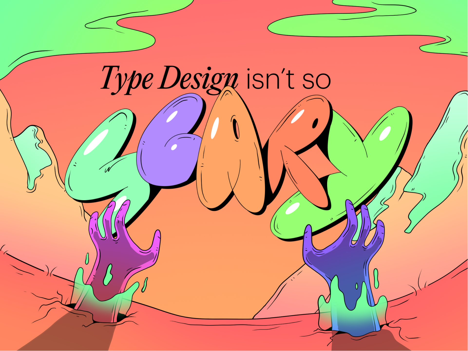
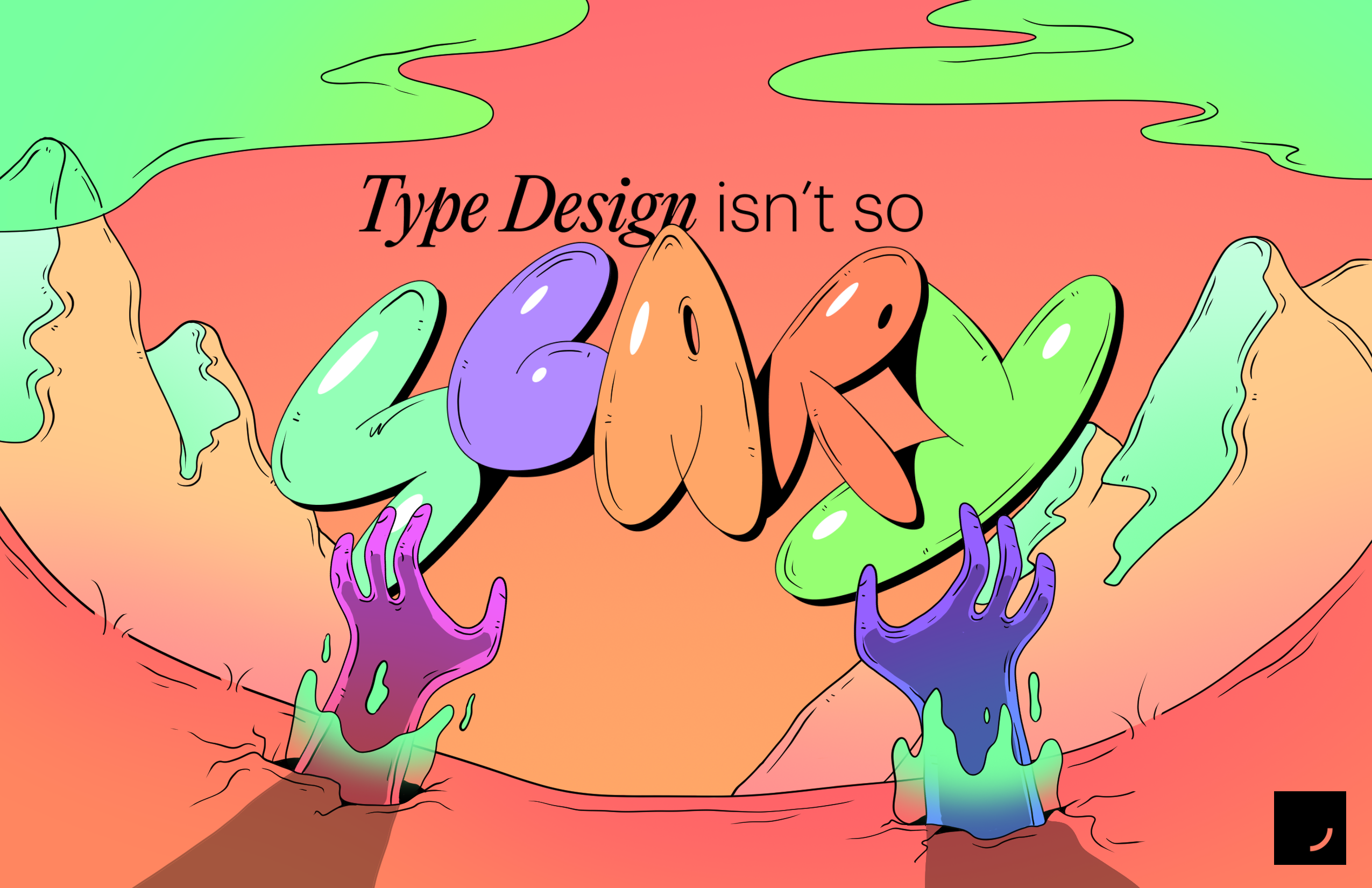
Type Design isn't so Scary
July 26, 2023
Any visual designer can relate to the powerfully overwhelming task of searching for the perfect typeface for a project. There are hundreds of thousands of fonts to choose from when designing a brand that allows for complete creative control. A couple months back, we were met with such an opportunity at a small studio when Designers are Scary was conceptualized. Oh, the endless possibilities. The endless choices. Naturally, we decided to choose none of them and make our own. 🤷
Turns out, the best course of action was creating our own hand-drawn font! We knew the exact vibe we wanted, so we ran with it. Branding Designers are Scary (which I will now be referring to as DAS.) was my first project at a small studio back in February, and what came from this time of exploration and play led to one of our largest, most engaged recurring events at the studio.
Passionately, a small studio is all about empowering the emerging creative, and what better way to do that than to remove the curtain and show our unfiltered process of how we get things done around here.
So, here's how it happened…
Step One - Drawing It Out by Hand
So turns out, we bit off a little more than we can chew. Illustrating the typography for every DAS event is a lot more work than it needs to be. We need to figure out how to turn this into a font file.
Any illustration program would have worked for this step: Photoshop, Illustrator, MS Paint, the Pen tool in Figma, doesn’t matter. Whatever you like! My illustration program of choice is Clip Studio Paint, a program that I jumped head-first into years ago when I was still figuring out my creative work flow.
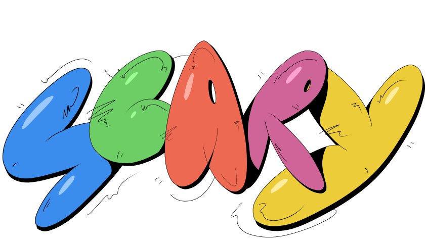
Drawing our font was the best part about all of this! We wanted a silly, bubble letter, cartoon look to completely juxtapose the intimidation of what a “scary designer” would feel like to an emerging creative. Easy. Creating the key art in this fashion took some time, but was an extremely enjoyable process. The issues came when new graphics promoting the event were needed.
Who was going to be able to take over if I ever wasn’t able to draw things out myself? We needed to get this type process on a program that everyone in the studio could use.
Step Two - Jumping Into a New Program
How the heck do you even make a font file?? TBH, it’s easier than you think.
The most sound solution to our scalability issue of this brand system was creating a downloadable .otf font file that everybody could use. This would alleviate any need to hand draw these letterforms moving forward. After each and every letter was drawn once in Clip Studio Paint, there was no need to ever return to that program when creating DAS graphics.
Cut to Glyphs. Our second program in this process.
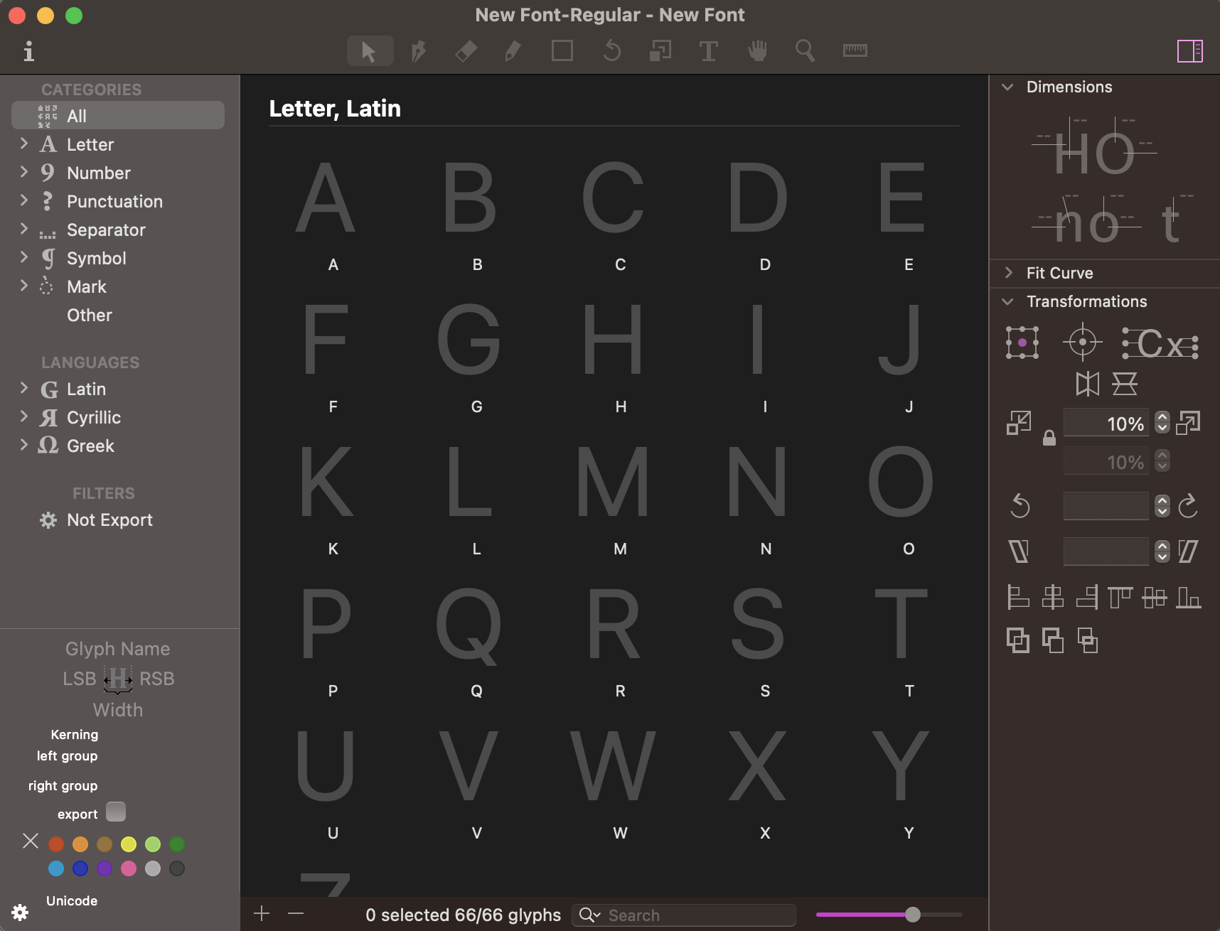
For those who don’t know, Glyphs (specifically, Glyphs Mini) is a shockingly user-friendly typeface development tool where users can create their own font files. In my opinion, this is one of the necessary programs for any designer remotely interested in type design. Each Glyphs file has an empty space for every glyph form you could think of. Letters, numbers, punctuation, every international character set, you name it. All you gotta do is create the matching vector in any style you want, and you’ll be able to type with it.
PS. Glyphs has light and dark mode. We care about things like that. 😎
Because we had every letter of the alphabet drawn out and ready to go, we could drop a screenshot in and trace over using everybody’s best friend, the pen tool. Super easy!
Step Three - The Pen Tool. Not So Easy.
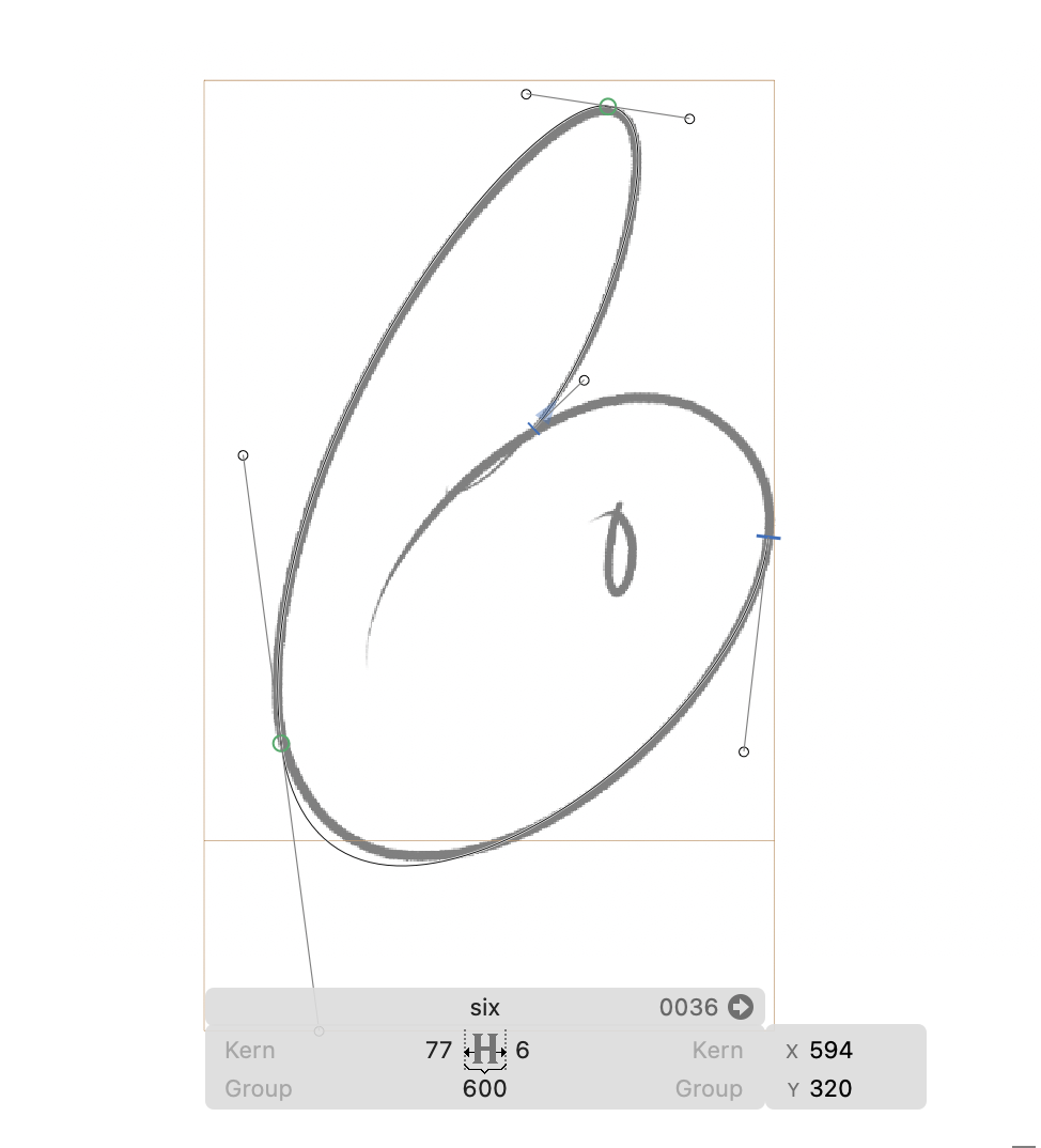
Unforeseen-Technical-Difficulties alert! Scary Designer is an outline, cartoon font. This is an uncommon type design choice, so we need to get crafty in Glyphs.
Using the Pen tool in Glyphs is almost identical to Illustrator or Figma, so tracing out the screenshot of our letters was quick and simple. Glyphs, on the flip side, does not let you toggle between fill and outlines when you create a vector. It will always fill in the shape as a default, and you would have to switch to outlines in a different program. This is not at all what we wanted. We were hoping for our font to appear more cartoony which would require overlapping outlines, variety in line pressure thickness, and other minor visual elements that just doesn’t work with solid bubbles.
No, the line work itself needed to be a closed shape. Yikes.
After a lot of googling and research on the Glyphs forums, we found a system that works to alleviate this issue: offset curve by 1 pixel -> make stroke. This simple solution allows this font to operate almost exactly how the illustration works, including a variation of line pressure, which solves for an issue of appear too vectorized. Perfect!

The Scary Designer typeface operates with two weight styles: Outline and Fill. This is a sort of non-traditional approach to type design, but it allows for the most ease when delivering the font to users who don’t want to spend time filling in the cartoon outline themselves. This experimental font can therefore lead to a ton of experimental use-cases!
Step Four - Testing, Testing, Testing.
The fun doesn’t stop there. There’s nothing worse than a typeface with unpredictable, unbalanced kerning. Cut to hours of typing out fun words making sure the spacing is clean.
I’m sure most designers can relate to the unhealthy obsession that is pixel pushing when nearing the end of a project. This phenomenon has never been more prevalent in my professional life than when polishing off a typeface for use. Every letter requires personalized spacing to create visual balance. Curves and points in typography need to overcompensate when compared to flat lines on a horizon. Counter spaces need to be filled uniquely with each letter pairing. It’s a lot!
I went into this process knowing that this could come at the detriment of my other work responsibilities. So, I let myself have fun with this process and would remind myself that this font is supposed to be silly. That’s the beauty of a display typeface. If there are imperfections, call it stylistic~. Okay, maybe that’s not the best advice, but having grace with yourself will make life as a designer a lot less stressful. Moral of the story? It’s an important and hard skill being able to give yourself permission to not obsess over the little things. For your mental and physical wellbeing, sometimes you just can’t let yourself go there.
Besides, who has time for stress when you’re having this much fun?
Step Five - Set It Free.
You create a typeface in order to serve a purpose. You’re filling a small space in the design world that was previously open. While creating the typeface was a fun project, there are countless other projects & designers just waiting to take your font and run.
It’s time to hit publish! I gotta be honest, there is no greater feeling than packaging up a font family into a little zip file and uploading it somewhere safe. Making the font was a whole lot of fun but being done with it is even better.
Updating DAS marketing graphics is way easier than ever. Instead of spending a half hour drawing out the perfect #3, I just need to hit it once on my keyboard. I’m not sure if or when anyone else will be downloading and using Scary Designer, but the fact that other designers even have the option to download it if they want to is pretty surreal. Hours of somebody’s life- my life- exists in a simple .otf file and I love re-experiencing that joy every time I use it. What a weird emotional time capsule.