Oops! Something went wrong while submitting the form.
A great product no longer sets you apart in today's profoundly fragmented market. Holding and sustaining the consumers' attention now demands an intuitive brand experience rooted in their wants and needs.
As simple as it sounds, many neglect this basic principle. It's easy to get enamored with technical capabilities, forgetting that consumers are swayed by emotional connections first. Think of your favorite Pumpkin Spice Latte from Starbucks (over 424 million sold). Is it really the taste or feeling that keeps you desiring it? Or your precious designer clothing brand you constantly shell out wads of cash on - odds are, functional superiority isn't the allure. It is the identity that resonates with you.
Odds are, functional superiority isn't the allure. It is the identity that resonates with you.
We build powerful connections between companies and customers by extracting what makes audiences tick, and then we craft digital and physical experiences aligned to their sensibilities. We go beyond the flashy visual representation and palette pairings to embed your brand purpose into all digital touchpoints and creative campaigns.
This intentional identity-driven process of ours results in immediate brand recognition and familiarity. Honestly, it's human nature - we gravitate to the recognizable. We collaborate to consistently reinforce your visual and verbal identity, to imprint it naturally in the minds of consumers. This approach always influences your Return on Investment and elevates your customer's lifetime value.
This approach always influences your Return on Investment and elevates your customer's lifetime value.
We circumvent costly mid-stream product changes by truly understanding your customers upfront via design thinking. Remember New Coke? (maybe not)The meteoric rise and fall occurred because flavor tests didn't account for deep nostalgic brand attachment. We won't let you make similar missteps, because we build a process around you that asks all the right questions to fully understand your customers’ peculiarities.
Our track record is impeccable as Design partners who build brands for longevity. Across industries, we have collaborated and contributed to developing customer-inspired experiences that generate revenue, loyalty, and growth.
Everything starts with identity- this expression is the sum of all our minds and gifts at a small studio. We approach design through narratives of identity to craft timeless ethos that transcends industry touchpoints. With our unique technique, it's not business as usual when we finally get to pushing pixels. Our output triggers affinity in the hearts and minds of people, and our partners are crystal on "who they really are," setting them up for success in today's hyperconnected world.
Now, several digital channels are vying for the attention of users- websites, mobile apps, social media, Alternate Reality, and beyond. The opportunities are enormous, but the challenges are immense to find fluency and authenticity regardless of channel- it is why we do all the work that allows the introspection that delivers a straightforward narrative.
To succeed and find resonance today, there needs to be harmony between design and the stories the brand shares. The visual identity, copywriting, illustration, micro-interactions, product interfaces, and messaging have to feel like one and the same, and this is only possible when identity is established early-on. We emphasize this by making sure our partners go through our Identity Architecture Workshop from the jump.
We will continue diving even deeper into our Identity Architecture framework at every chance we get. Today, we will focus on some resources/tools we interact with daily and highlight moments where they have shown harmony between design and storytelling and how that influenced resonance.
Mailchimp says they always pair their logo with Freddie(the mascot), which always has a wink to demonstrate its great attitude towards everything. Freddie is a playful representation of the brand, and their copywriting is often conversational and cheeky. The brand comes across as an approachable human, which invites people into a community of business minds that have empathy while also having fun. It totally flips the narrative on the often dry world of email marketing.
Spotify is essential to our lifeform and conversation at a small studio. Its existence is why the Gen-Zs never stop teasing the millennials. But think about it: the visual brand assets are incredible, and the playlist personalization experience is intuitive and immersive. It embodies a visual language that radiates culture and the importance of music for survival. A delicate balance that makes it seem like music is on Maslow's hierarchy of needs.
Slack is where 99.9% of our communication happens. And it feels like home, making work simple, fun, collaborative, and productive. The interactions are beautiful, the illustrations delightful, the language inclusive, and the intentionally animated confetti are goals. Everything that makes it work, are no mistakes; they result from carefully thought-through design decisions to match a narrative.
The smallest details matter greatly, whether transitions, corner radius, colors or microcopy; we sweat them all. We set out daily to create harmony, to align design with narratives that can last a lifetime.
One thing is for sure: the specifics of every brand differ across channels, so we will always anchor the experiences with a unified story and fluid design narrative. We stay coherent to resonate emotionally and separate our partners from the clutter. With our meticulous harmonization of design and storytelling for our partners, we create deeper customer connections and ensure longevity.
As designers, we tend to get caught in a cycle of constant creation, because of how much love we have for what we do. We move from project to project, translating creative concepts into tangible digital products. Our innovative juices flow freely as we pull inspiration, jam, wireframe, design, refine, and deliver the finished work to clients. But just as athletic performance depends on rest and recovery between workouts, our creative brains also need a break to recharge.
Research shows that time spent letting the mind wander without conscious focus allows unique connections to form between ideas. This incubation period often sparks "eureka" moments of sudden insight and clarity. In a sense, stepping away is when our subconscious creative process can happen most effectively. Have you ever had a lightning bolt of inspiration in the shower or while walking your dog?
That's no coincidence—it's the result of giving your brain space for random connections.
Though it may feel counterintuitive to "slack off," understand that you'll return with renewed mental clarity, focus, and creative energy by giving your mind a chance to reboot away from work. A few days untethered from Figma, Adobe, or Webflow clears away the clutter of daily tasks, allowing you to access the deeper wells of your imagination.
Creative work follows a natural rhythm between intense effort and restorative rest. Regular vacations, entirely disconnected from the daily grind, enhance your work's overall quality and innovation. Go offline and let your mind wander without an agenda—whether it's a weekend camping trip or lounging on the beach with fiction novels. This distraction-free time works wonders.
Time spent in nature boosts creativity and problem-solving skills more than in urban environments (Sorry, City-lover). So get out and go seek some greenery! Unstructured playtime activities like painting, ping-pong, and making music allow your brain to make novel connections.
Trust that your best ideas may arrive precisely when you stop trying so hard—far away from Figma.
Your brain and your next client project will benefit tremendously. Just keep a notebook handy to jot down your inspirations while on your creative retreat!
Whether or not you grew up playing games in some way or another, the reality of competitive gaming influencing our working world has become all too relevant. The sub-culture around gaming as a competitive force comes very naturally to the competitive side of human social interactions.
If you've never rolled a 20-sided dice, lost sleep over a board game, or scrolled strategy guides online, you would be surprised by how much you share in common with those who do. While some positives can come from such a mindset, there are inherent limitations to be on the lookout for.
Very quickly about myself, I've been a student of gaming and business for as long as I can remember. My first tournament victory was at the young age of 13, having learned an immense amount about the camaraderie that surrounds the gaming industry from a group of Gulf War Veterans. Since then, I have been testing games, winning games, losing games, and losing sleep over whatever game took my attention at the time. It wasn't until I had my first two children that I began to see how many of the toxic aspects of competitive gaming have penetrated many people's minds.
Playing to Win vs. Playing to Grow
I find the concept of playing to enjoy the practice of competition itself has almost lost its place amongst the average person that I engage with. It has become almost anti-ritualistic to not "root to win" for a home team or the feeling of self-pity that comes from not winning an ultimate championship in whatever sport or game you are pursuing. The idea that we play a game to win at all costs, and this should consume our attention and focus, is far from how we should be viewing the act of competition.
We must step back and think hard about the human interactions that go into playing any game. We are facing an opponent who shares the same struggles for excellence that we do. It is with this shared journey that the door to bonding opens. Remembering this important component of the game is as important as any strategy to win. Knowing your opponent is one of the keys to succeeding at any competition, therefore undermining the human bond shared in competition is enough of a disadvantage as any other.
We often see this in professional sports today, as people care so much about the team they root for and leave little on the table of respect for other teams or players. Rivalry leads to hatred at times even. If Miyamoto Musashi inspired any single point in my journey of competitive gaming, it would be that any emotion clouds the path to success. Emotions come from the realm of extreme indulgence of one idea or another. Focusing on winning at all costs and losing the bond of competition with your opponent are easy paths to stress dominated mindsets. An assured path to toxicity and ultimately a lack of success while playing the game and how that game translates into your life.
Min/Max downsides
A lot of people have probably practiced the min/max strategy of playing games or conducting business far more than they have realized the toxic tactic itself. How many deals fell through because some stakeholder refused to budge on a profit margin? How many relationships ended because one side was taking and never giving? How many projects tied down in the details that matter more to a perfectionist than someone trying to ship an MVP? The concepts of minimizing risk exposure while maximizing output are as toxic as they are invisible in the moment of decision making.
A lot of attention falls on min/max in games that require long lasting decisions to be made. Planning a character in a role-playing game with the exact perfect blend of stats to get that extra point of output is really where this has become almost automatic in the minds of so many gamers. There is a huge misconception though when it comes to long term planning. How many of us can fall in love or find joy in making decisions solely on the basis of minimum risk and maximum output?
If we are talking about any project, game, relationship, or transaction that is going to stand the test of time in our minds, we need to find the elements of the action that drives our romantic desires just as much as we need to maximize an output.
Have you ever had that feeling of anti-climactic finishing? A lot of that comes from this pursuit of approaching a long road with such a limited care of our love of the journey itself. We fight a struggle along a road of hardship to get to an achievement, yet when we get there the achievement feels hollow. It is all too common and it starts with the fact that loving the journey is far more important than loving an outcome.
When we make every decision in life with the context of maximizing the final output while minimizing our pains along the way, we lose so much more on the journey itself. To recollect with friends about trials and tribulations shared ten years from now is what you will desire. No one shares a nostalgic moment about how success was slightly more efficiently achieved compared to the journey of struggle itself.
If you want to start a successful journey, it will take time to find that final destination. Loving the road is as important as the motivation behind the outcome. To get to the end of a struggle, the romance of our memories holds more pleasure towards the process itself rather than an extra margin of output.
Recency Bias and Capitalism
Let's get into a very real economic conversation around our consumer industry. Companies make no money when fans of products aren't actively purchasing. Therefore, the idea that the new thing is always better than the old is as real of an institution as it is an action of biased perspective.
There are times when the new thing is better than the old, and there are times when it is not. However, it appears that the ability to analyze either situation objectively is completely lost on many consumers. This shows its ugly head when companies are allowed to get away with providing a worse product for a higher price and harm the consumer along the way.
We have seen the concepts of artificial scarcity show up a lot in the recent years post-covid and this is a big part of the reasoning. Consumers are blinded to the value they receive given the new label on lesser quality products. It has shown up in most industries I have personally interacted with over the past few years, and I think we are starting to see consumers get wise to these toxic practices.
If consumers are only ever searching for new, and are unable to contribute value in the old stories of our past moments, it is an easy path towards diminishing value. Competitive gamers are always searching for that edge to victory. The idea that the newest strategy is always better comes at a significant cost compared to simply refining an old approach that can garner more sustained success over the ups and downs of your competitors.
Gambling Addictions
We are starting to see the impacts of a generational addiction to gambling right now. We have become desensitized to the idea of gambling, so much so that it has shown its face even in our school systems. Micro-transactions on mobile games and the ease of gambling on any sporting event have become so commonplace that we are almost unaware of the negative effects of a gambling mindset.
Gamification of school is not smart, I will stand by this point until I die. Let's discuss the real core competency when it comes to learning, it is the pursuit of learning itself. Let's grow a generation that loves to learn for the sake of self-growth. Learning out of obligation is as bad as learning out of positive reinforcement.
If we train a generation to engage with society solely based on a positive outcome, is that creating the inherent benefits of advancing the greater good? Is the greater good a concept relevant in a society completely addicted to the dopamine fix attributed to gambling on the transaction of the moment? The answers are ‘NO’; they are not.
Innocent applications of gamifying transactions have spiraling implications across industries. Look at professional sports and how consumers watch sports in 2023 compared to 2000. I remember watching sports as a teenager, and the depth of analysis was far more impressive to me back then. It seems that watching sports with friends has become a selection of scoring compilations rather than a deeper analysis of team tactics.
The toxicity of reducing your love for a game to show-stopping events is akin to limiting your brain's understanding of tactical prowess. If you want to get better at playing the game of life, you need to start paying attention to the minutiae of tactics at the lowest of levels first. Incentivizing the end result is the furthest thing from respecting the tactical elements of a competition. To love the act of growth needs to be the reward that is incentivized above all.
A knife stays sharp when it is scraped against a rock, not when it is cutting paper.
What a great game looks like
A great game, the concept lost to many, focusing on the toxic aspects of competition above all other denominations.
Find someone who loves the origin story just as much as they love the final action sequence.
Find someone who loves the process of losing as much as they love the final act of winning.
Find someone who has a desire for struggle simply because they desire to learn.
Find someone who finds joy in winning fairly above winning at all costs.
Find someone who enjoys great stories of old times as much as they love new experiences.
Find someone who can give as much as they receive and still stay friends.
At the heart of it all, a great game is more about the action of playing the game itself rather than winning. Pursuing this reality puts people around you who can stand the trials of life far better than those that do not. Life is struggle, embracing that struggle is at the heart of aspiration.
To be the best version of yourself requires the mindset that you will never be the best version of yourself.
Take a deep breath, hold it. Now exhale! That simple, natural act is how we believe design should naturally fit into our partners' businesses. It should be effortless and seamless so that it is hardly noticed. On the other hand, its impact should be felt across all integral touchpoints (digital or physical).
The breathing process reflects our design principles and our approach to forging partnerships. Breathing is an indispensable process for all living beings, and design is very much the same way for strategies, narratives, visions, and even down to hiring.
We are a design partner as steady and efficient as your breathing. A statement that we mean every alphabet of, and here are a few reasons why we see ourselves that way and how it only empowers our partners.
Deep Breaths
Meeting a new client(partner) for us is like taking fresh air into the lungs; it rejuvenates everyone on the team. We use it to exchange information, hopes, fears, and aspirations. Frequently, at the end of our partner meetings, we have a robust understanding of who they really are, what they need, and what beautiful story they want to share with the world. We are beyond curious and linger on every sentence shared, anecdotes told, and even passing dreams. This efficient onboarding system integrates us into the DNA of our partners, and it is an empathy and identity-driven process reflected in our deliverable.
Mighty Lungs
Have you ever played the game "Broken Telephone" or "Chinese Whispers"? That's often what the exchange of information feels like when collaboration occurs between huge teams. A lot of critical messages get lost in translation, and that is so not our vibe. We intentionally keep our team small, often establishing a direct line of communication between our designers and the client-partner. No one meddles with the message or alters the meaning or feeling behind it. Every whisper of our partner is heard by those who need it to string a narrative or paint a masterpiece. We work in tandem like the lungs and heart, oxygenating critical information to fuel the growth of our partners.
Exhale
After we've taken in all the information appropriately, our design team synthesizes it carefully, filtering the gems from the clutter. This naturally leads to crafting a compelling design narrative and identity. The intent is always to deliver a design solution that can last a lifetime. Every bit of it is imbued with the essence of our partner, woven intricately beyond expectation. We sweat all the small stuff, and it shows.
Rhythm
Each breath is a new song with the same beat, and that is based on fact; absolutely no two breathing patterns are the same; each one has a unique rhythm. Similarly, every partner we work with is provided a bespoke design system, identity report, or digital assets that empower them to stay consistent yet dynamic. Whether it is a name, logo, color palette, or an intuitive website - our design team's output is in sync like a heartbeat.
Every brand deserves a partner who understands its rhythm, which is why a small studio exists. We allow our partners to focus their expertise where it best serves their vision while we support them intentionally with design solutions that craft narratives that transcend time.
Mentorship is more than just a buzzword; it's a powerful tool for personal and professional growth. Whether you're a seasoned creative or just starting your journey, this guide is your roadmap to being a stellar mentor in today's world.
Has someone ever come to you for help, and your first thought was, "Me? But I barely know how to ____." or, "There are people with so much more experience!" As someone working in the design industry for three years, tenure isn't everything. A person with 20+ years of experience may not always know best. No matter where you're at in your journey, you are uniquely equipped to help others. You have experiences others have only read about or seen on a screen. Instead of worrying about what you can't teach, consider all the gifts that make up your unique skillset.
Recognize and embrace your gifts!
First things first, know what you bring to the table. Your unique skills, experiences, and insights are your gifts. Embrace them and recognize that you have something valuable to offer.
For example, a Creative Director will have plenty to share about client relations, managing designers, and leading a team, but if they've been at the same job for 10 years, they most likely don't have the most relevant advice when looking for a job. I love sharing my experiences relating to the job hunt because I've had two jobs in three years and am an active part of a small studio's recruitment process. Relevant experience is everything!
Be honest about your journey
Nobody knows it all, and that's perfectly fine! Be transparent about your journey. Share your own learning experiences and definitely your mistakes. The best thing you can do as a mentor is save someone from the heartache that you went through. I sacrificed sleep, a social life, extracurriculars, and my sanity to get into the Graphic Design program at the University of Florida (UF).
Once I was in and able to reflect on the application process, I wanted to open the door for others so they didn't have to go through all the same stress I did.
"The best thing you can do as a mentor, is save someone from the heartache you went through.”
Foster a safe space
Create an environment where mentees feel safe to ask questions, share concerns, and express their opinions. Encourage curiosity, and curiosity will flourish. You're a mentor, not their boss, so the stakes should be pretty low. Celebrate those wins, no matter how small. But don't shy away from discussing failures. It's where some of the most valuable lessons hide.
Encourage collaboration and an abundance mentality
Facilitate connections among your mentees. Encourage them to collaborate and share ideas with their peers. Learning from each other can be just as valuable as learning from you. I used to think my classmates were my competition, not my collaborators. It didn't let up once I was accepted into the design program. The scarcity mindset seemed to pervade every semester.
Whether it was group projects, internships, or job applications, it was me against my classmates, against anyone else who might "steal" my spot at a coveted design agency. But that wasn't the reality. Classmates and peers are your network and support system, not your competition.
Help mentees identify their objectives and aspirations
Work with your mentees to set clear, achievable goals. Help them map out their path and provide guidance along the way. Even if you can only help from point A to B, they'll be further along than when they started. Lead by example. Share your own goals and the progress you're making. It shows vulnerability and reinforces the idea that mentorship is a two-way street. You never know; your mentee may be the fresh set of eyes your project needs.
Embracing Growth Through Mentorship
Mentorship is a journey of growth for both mentors and mentees. It's about creating a positive and supportive relationship that fosters development. So, dive in, guide others, and watch yourself evolve in the process. I've talked to high school students wanting to start off on the right foot, college students absolutely terrified of the job hunt, new graduates trying to find their place, and even creatives who are older and more experienced than me. I definitely don't have all the answers, but I have plenty to share.
First things first, how we see it; The World is our Studio 🌎.
Now that we've gotten that out of the way, let’s do some humble bragging that lets you in on what has worked for us and how you can implement some of them if you have a fully remote team or dream of being a part of one.
Our team at a small studio are of global tapestry; spanning longitudes and latitudes- yet we collaborate exceptionally well, producing incredible design solutions as a unified force. Over the years, we have gleaned insights and tweaked our style of collaboration accordingly.
Here are a few things that continue to allow us bring the heat!
Trust: Trust is our number one elixir. When a team is distributed, trust is that foundational ingredient that expedites the entire process. You have to trust that everyone will communicate openly and honestly, meet their deadlines, and deliver exceptional work individually or collectively. Our trust in one another is so next-level, and it works wonders. We enhance this trust through regular check-ins; we do not micromanage any team member. If they say they will get it done, we trust them.
"Our trust in one another is so next-level, and it works wonders."
Communication: In every relationship, sharing from the heart keeps expectations in check and hearts in tune. So, we over-communicate with one another to prevent isolation of any sort. We don't get nosy about what others are working on, but we keep our Slack channels open and Zoom calendars available to Jam, share ideas, and ask questions. And our communication is about more than work. They are filled with pictures of pets, videos of kids, dope playlists, and viral TikToks to keep the millennials up on things. 😉
Gracious Feedback: Critique is essential for growth but can be trickier when done remotely. Every one of us always gives feedback politely and constructively. And every one of us is open and responsive to feedback, too. The regular exchange of insights makes our team and design solutions even more exceptional.
Big Picture Thinking:Absolutely nothing is hidden from one another regarding a task to execute. Context and clarity are always provided so the team is in sync. As progress is achieved on a project, the entire team is carried along to understand how the destination is reached and how much impact can be achieved for the partner.
Celebrate Wins:Quite often, we have game nights that bring out the dark side of many of us. The next one is a Dungeons and Dragons edition (We will consider inviting you). Game nights, happy hours, Squirrel moments, meeting shoutouts, kind words, and some gifts- all kick the team's morale into high gear and make everyone feel they belong.
We have seen how all the highlighted points have unlocked the potential of every one of us collaborating remotely, and we are beyond grateful that we have the right collective of talent to make the magic happen.
We hope everything we shared comes in handy for you or anyone else you care about. Kindly push this piece forward to empower someone out there.✌️
At a small studio, the expression "listen twice, speak once" reflects our approach to innovation and collaboration. It might sound simple, but it is the source of many great design solutions we deliver. Active listening is an important skill; we deploy it among ourselves and our partners to grow intentionally.
Before commencing most of our (client) partner projects, we run our trademarked Identity Architecture framework. This allows us to listen intentionally to all the project stakeholders collectively and also go further to conduct one-on-one interviews with them.
During the workshop, we ask all the relevant questions about the project and the individual perspectives of everyone that makes a conscious decision about it.
The extensive act of listening on our part charts a different course of action for the solutions we execute or propose. By listening actively, we hear all the unsaid points or challenges that should have been briefed. All of these insights uncovered drive an ingenious approach to design.
We deploy active listening amongst ourselves and not just our clients. Being a fully remote team of creatives operating across continents and time zones; the moments we spend together and how we collaborate dramatically influences the quality of work we deliver.
So we listen carefully to the body language of everyone, for when they need support or a divergent opinion on whatever they are working on.
For emerging creatives, active listening empowers them to become better conversationalists and collaborators. It teaches the unique skill of forming connections with clients and coworkers. It is a lifelong communication skill that continues to reward extensively.
In all honesty, with active listening, our partners are placed at the center of our actions and processes. This means we go beyond just knowing what they want. Our approach makes us deeply understand the context of their needs, which keeps us up with endless ideas. So far, it has inspired us to innovate, explore and be ahead of their needs.
We all need to be active listeners as designers; it cuts down the time of execution and increases the chances of getting projects right the first time.
So, listen actively! It makes a world of difference.
This piece goes out in the 24th edition of Ding! (our beloved newsletter) on the 8th month of the year 2023. It's a web of serendipity because the two numbers have an everlasting level of symbolism. We are not Basketball nerds, design is our Jam, but as it turns out, the jersey numbers 8 and 24 were worn by the iconic Kobe Bryant.
The number 8 for him reflected his grit, love, and dedication to the game, while 24 manifested his maturity and insight into playing the game. Noticing the two numbers got us thinking about his love for the game of Basketball, like that feeling-alive in the eyes of Designers.
So today's read is a love letter to design. To design is to love, live and breathe life into things. As basketballers glide across courts, you dance fluidly through each project with passion and pride.
It's rarely a job to you- a calling is a more accurate description. You can't fight the urge to craft something meaningful out of nothing. The blank canvas taunts and thrills you, leaving your senses tingling. Like basketballers obsess over mastering their game, you relentlessly practice and study to improve your gift.
You constantly push yourself to get your work to the next level because you know too well the deep satisfaction of visualizing a concept, iterating, and tweaking the colors, type, and layout until you birth your imagination.
The feeling that comes after the buzzer sound is why you do it- Arms folded, back reclined, a smile of self-admiration plastered across your face as you silently whisper to yourself, "I am the @#$&!".
But one thing you know too well is that coming up with the perfect play is not a casual walk on the court; it requires teamwork. So you constantly seek to listen, collaborate, and understand the distinct perspective of others. You leave the Ego out of the process, diving into a rhythm of back and forths to gain new ideas and establish a play that works.
Absolutely nothing is more rewarding than envisioning something, putting your skills to work, and manifesting a finished product that gets people's OOHs and AAHs out.
So Designer, if you have made it this far, your never-ending quest to achieve excellence in your craft will always be the ultimate adventure. Your focused creativity is always in action; you just constantly find yourself on the court.
Keep shooting your shots, and never stop chasing the thrill of watching your vision come to life.
If you’ve got 3 mins and 57 seconds, quickly give Kobe Bryant’s Oscar Winning Short Film. It's was his love letter to the game. Slide into our DMs, if it had you in your feels.
The internet is an activity-filled digital landscape. So many things happening simultaneously, making it quite challenging to focus. Whenever we design to contribute to this technological landscape, we do it meaningfully while never forgetting one essential mission- "Do the right thing, build it accessible."
Many design decisions exclude individuals with disabilities from accessing and fully experiencing the vast resources provided by the digital landscape of the internet. We should not just be ticking a compliance box but be inclusive while expanding our audience.
The lack of accessibility in design is pretty much like that story narrated by Saul (the Jewish character) from the comedic cult-classic, Coming To America.
“A man goes into a restaurant and sits down; he's served a bowl of soup. He says to the waiter.
Man: Waiter, come, taste the soup.
Waiter: Is there something wrong with the soup?
Man: Taste the soup.
Waiter: Is the soup too hot?
Man: Will you taste the soup?
Waiter: Is the soup too cold?
Man: Will you just taste the soup?
Waiter: Alright, I will taste the soup...where is the spoon?
Man: Aha! That's the question.”
When accessibility is ignored, we design without giving some people the means to experience the brilliance or deliciousness of the soup. Meaning loads of enthusiasts are left on the sidelines, barricaded. From users with visual impairments to those with motor disabilities and beyond. Here are a few ways we think you can influence your design to make them accessible.
Typography and Color Contrast
Typography and color are critical elements in design; they influence a great deal of user engagement. So, always opt for clear, easy-to-read fonts while considering the aesthetic appeal. Also, ensure that color choices contrast adequately. This will make content legible to users who have low vision or are color blind. Constantly use free contrast checker tools to validate your design choices. You can find some cool ones here.
Alt Texts and Aria Labels
These two rarely recognized heroes are responsible for screen-readers being able to narrate the story of your design to visually impaired users.
Always provide appropriate information whenever you see the opportunity to include content in the Alt Text field or implement Aria Labels (HTML that helps understand interactive elements). It goes a long way!
Keyboard Accessibility
This is, by all means, the red carpet for users who can't use a mouse or engage with a touch screen. So, make sure your links, buttons, forms or even slideshow can be interacted with via the keyboard.
Captioning and Transcripts
This might not be something you do every day, but who knows? Almost everyone has a multimedia content channel these days. Provide captions for your videos and transcripts for audio content so that users that are deaf or hard of hearing can still be immersed in the content you have designed.
Responsive and Adaptable Design
We touched on this crown jewel in our Think Mobile article; it can not be over-emphasized. Your designed website or application should be fluid across screen sizes. It should adapt like a chameleon to the user's screen assistive needs.
We know you continue to see tips like these wherever you turn, but they are essential to creating a more inclusive digital landscape. You spending a few minutes absorbing these means we are even closer to empowering more designers to build with empathy.
Any visual designer can relate to the powerfully overwhelming task of searching for the perfect typeface for a project. There are hundreds of thousands of fonts to choose from when designing a brand that allows for complete creative control. A couple months back, we were met with such an opportunity at a small studio when Designers are Scary was conceptualized. Oh, the endless possibilities. The endless choices. Naturally, we decided to choose none of them and make our own. 🤷
Turns out, the best course of action was creating our own hand-drawn font! We knew the exact vibe we wanted, so we ran with it. Branding Designers are Scary (which I will now be referring to as DAS.) was my first project at a small studio back in February, and what came from this time of exploration and play led to one of our largest, most engaged recurring events at the studio.
Passionately, a small studio is all about empowering the emerging creative, and what better way to do that than to remove the curtain and show our unfiltered process of how we get things done around here.
So, here's how it happened…
Step One - Drawing It Out by Hand
So turns out, we bit off a little more than we can chew. Illustrating the typography for everyDAS event is a lot more work than it needs to be. We need to figure out how to turn this into a font file.
Any illustration program would have worked for this step: Photoshop, Illustrator, MS Paint, the Pen tool in Figma, doesn’t matter. Whatever you like! My illustration program of choice is Clip Studio Paint, a program that I jumped head-first into years ago when I was still figuring out my creative work flow.
Drawing our font was the best part about all of this! We wanted a silly, bubble letter, cartoon look to completely juxtapose the intimidation of what a “scary designer” would feel like to an emerging creative. Easy. Creating the key art in this fashion took some time, but was an extremely enjoyable process. The issues came when new graphics promoting the event were needed.
Who was going to be able to take over if I ever wasn’t able to draw things out myself? We needed to get this type process on a program that everyone in the studio could use.
Step Two - Jumping Into a New Program
How the heck do you even make a font file?? TBH, it’s easier than you think.
The most sound solution to our scalability issue of this brand system was creating a downloadable .otf font file that everybody could use. This would alleviate any need to hand draw these letterforms moving forward. After each and every letter was drawn once in Clip Studio Paint, there was no need to ever return to that program when creating DAS graphics.
Cut to Glyphs. Our second program in this process.
For those who don’t know, Glyphs (specifically, Glyphs Mini) is a shockingly user-friendly typeface development tool where users can create their own font files. In my opinion, this is one of the necessary programs for any designer remotely interested in type design. Each Glyphs file has an empty space for every glyph form you could think of. Letters, numbers, punctuation, every international character set, you name it. All you gotta do is create the matching vector in any style you want, and you’ll be able to type with it.
PS. Glyphs has light and dark mode. We care about things like that. 😎
Because we had every letter of the alphabet drawn out and ready to go, we could drop a screenshot in and trace over using everybody’s best friend, the pen tool. Super easy!
Step Three - The Pen Tool. Not So Easy.
Unforeseen-Technical-Difficulties alert! Scary Designer is an outline, cartoon font. This is an uncommon type design choice, so we need to get crafty in Glyphs.
Using the Pen tool in Glyphs is almost identical to Illustrator or Figma, so tracing out the screenshot of our letters was quick and simple. Glyphs, on the flip side, does not let you toggle between fill and outlines when you create a vector. It will always fill in the shape as a default, and you would have to switch to outlines in a different program. This is not at all what we wanted. We were hoping for our font to appear more cartoony which would require overlapping outlines, variety in line pressure thickness, and other minor visual elements that just doesn’t work with solid bubbles.
No, the line work itself needed to be a closed shape. Yikes.
After a lot of googling and research on the Glyphs forums, we found a system that works to alleviate this issue: offset curve by 1 pixel -> make stroke. This simple solution allows this font to operate almost exactly how the illustration works, including a variation of line pressure, which solves for an issue of appear too vectorized. Perfect!
The Scary Designer typeface operates with two weight styles: Outline and Fill. This is a sort of non-traditional approach to type design, but it allows for the most ease when delivering the font to users who don’t want to spend time filling in the cartoon outline themselves. This experimental font can therefore lead to a ton of experimental use-cases!
Step Four - Testing, Testing, Testing.
The fun doesn’t stop there. There’s nothing worse than a typeface with unpredictable, unbalanced kerning. Cut to hours of typing out fun words making sure the spacing is clean.
I’m sure most designers can relate to the unhealthy obsession that is pixel pushing when nearing the end of a project. This phenomenon has never been more prevalent in my professional life than when polishing off a typeface for use. Every letter requires personalized spacing to create visual balance. Curves and points in typography need to overcompensate when compared to flat lines on a horizon. Counter spaces need to be filled uniquely with each letter pairing. It’s a lot!
I went into this process knowing that this could come at the detriment of my other work responsibilities. So, I let myself have fun with this process and would remind myself that this font is supposed to be silly. That’s the beauty of a display typeface. If there are imperfections, call it stylistic~. Okay, maybe that’s not the best advice, but having grace with yourself will make life as a designer a lot less stressful. Moral of the story? It’s an important and hard skill being able to give yourself permission to notobsess over the little things. For your mental and physical wellbeing, sometimes you just can’t let yourself go there.
Besides, who has time for stress when you’re having this much fun?
Step Five - Set It Free.
You create a typeface in order to serve a purpose. You’re filling a small space in the design world that was previously open. While creating the typeface was a fun project, there are countless other projects & designers just waiting to take your font and run.
It’s time to hit publish! I gotta be honest, there is no greater feeling than packaging up a font family into a little zip file and uploading it somewhere safe. Making the font was a whole lot of fun but being done with it is even better.
Updating DAS marketing graphics is way easier than ever. Instead of spending a half hour drawing out the perfect #3, I just need to hit it once on my keyboard. I’m not sure if or when anyone else will be downloading and using Scary Designer, but the fact that other designers even have the option to download it if they want to is pretty surreal. Hours of somebody’s life- my life- exists in a simple .otf file and I love re-experiencing that joy every time I use it. What a weird emotional time capsule.
Mastering the art of ideation and execution is critical to any designer's success, but cultivating the craft of presentation propels you miles ahead of others. It is the fastest way to spotlight your gifts, front, and center.
We use our platforms to empower emerging creatives towards being able to achieve this. In this edition of Ding! we will highlight a few tips that make a world of difference when building a portfolio.
1. Have an Origin Story: Everyone you have ever respected or loved has a story you resonate with- It's what makes their vibe just right; you need one too. Take a moment to reflect on your design journey, how you fell in love with creativity, the challenges you overcame, and the skills you've honed along the way. Use your unique experiences to build a narrative that breathes life into your portfolio.
2. Present to Delight: Your portfolio should be a visual feast, showcasing your projects in the best light possible. Mock them up, place them in situ, and have prototypes. Ensure there's flair, finesse, and magic sprinkled all over it. A dazzling representation of your work can elevate a good project into a legendary one!
3. Assemble Your Faves: Your portfolio is your A-team, and each project is a formidable member with unique strengths. Choose your projects intentionally, representing your diverse range of skills and styles. Every project should be a compelling tale of triumph, of how you used your talent and perspective to overcome design challenges.
4. Embody Versatility: Flex your design muscles by including projects from different industries, and mediums. This versatility will demonstrate your adaptability and prove that you're ready to take on any creative challenge that comes your way. If your skillset is specialized,then you can tailor your portfolio reflect that exceedingly well.
5. Show Your Collaboration Skills: Teamwork makes the dream work! So, if you've collaborated with other creative minds or worked on team projects, highlight those experiences in your portfolio. This is how you signal your ability to thrive in a collaborative environment, a sought-after trait in the design world.
6. Make It User-Friendly: Your portfolio should save the time of potential employers and clients, not rob them of this precious resource. Keep your portfolio user-friendly and easy to navigate, so your audience can effortlessly explore your masterpieces and learn how your mind works wonders.
While all of these points are essential, one critical one is that you should only feature works you would love to do much more of in your portfolio. This prevents you from getting stuck doing work that does not fulfil you.
Every designer has uttered these words at one point or another; "I know I saved it" when searching for a much-needed design asset. You know the struggle—the relentless pursuit of the perfect design assets 🤦.
According to Creative Market, the average designer spends approximately 12.6 hours a week searching for design assets. That is a lot of time to embark on a weekly asset-hunt. Searching for the perfect font, illustration, icon, images, color scheme etc. Some designers, reading this, will be like;
"I need to change my ways." you should, because the time adds up. Perhaps, consider being more organized and intentional with your creative execution journey.
Every design endeavor shouldn't be a deep dive into the sea of sameness and an endless click-fest through websites with similar fonts, patterns, and icons. You need to start approaching your executions with a clear plan, arming yourself with a collection of assets before you ever need them. This ensures that you reach your creative vision swifter. See a few reasons why you need this;
Time is precious: Having a well-organized library of design assets at your fingertips, you spend less time searching and more time experimenting and unleashing your vision. No more aimlessly wandering through the internet’s wilderness—it's time to reclaim your hours and invest them in crafting extraordinary designs or even having more time to yourself to chill.
Consistency breeds excellence: When you have a system in place for organizing your design assets, you establish consistency in your work. Consistent use of fonts, illustrations, and icons creates a cohesive visual language that elevates your designs to new heights. It's like having a map that leads you toward consistent, high-quality designs that captivate.
Efficiency fuels innovation: When you're organized, you can quickly access the assets you need, enabling you iterate, and push creative boundaries. The more time you save on searching, the more time you have to explore new techniques, test daring ideas, and bring fresh perspectives to your designs.
Whether you are a seasoned designer or a newbie, everyone needs to embrace being organized and intentional. It is challenging to have enough time for execution in most of the tasks we execute as Designers, so optimizing the process is essential to creating work we can be proud of.
Keep those assets organized on the path to boundless creativity!
Dear Designer, we know how much you love Figma; we love it too. Playing Button Smash while brainstorming and designing with delight. Figma has been a consistent part of the lifestyle of many Designers, so we paid attention when they had their Config conference a few weeks ago. One of our biggest interests was the session with Airbnb's co-founder about being Design-Led, because it syncs with our cause of empowering creatives at a small studio.
We genuinely believe that Designers belong in the boardroom where critical business decisions are made; and the spotlight should find them and their gifts. Take a second and reflect on Apple and even Airbnb; successes propelled and sustained by the power of intentional design.
In 1997, Apple was struggling and on the brink of collapse. Steve Jobs returned with an unconventional approach. Understanding the power of design and its ability to shape experiences, he laser-focused the organization on aesthetics, user-centered design, and intuitive interfaces.
His Design-informed decisions transformed Apple from a mere technology company into a global powerhouse of innovation. Fast forward to today, design remains the core of their identity, which drives their products to become coveted objects of desire.
In a world where hospitality rules and most brands compete on price and convenience, Airbnb became a game-changer. It did this by integrating the concept of design-love into its DNA. Airbnb crafted experiences that resonated with the hearts of travellers worldwide.
Every aspect of Airbnb's brand exudes thoughtfulness and care, from its distinctive logo to its meticulously designed listings. Design became the catalyst for creating a lovable, global community of hosts and guests.
As a Designer, if you don't see how all of these relate to you yet, here are a few of your gifts that make you a natural leader;
1. Empathy: As a designer, you have the innate ability to empathize with users, understand their needs, and design solutions that address them. Your empathy extends beyond users to encompass teams, stakeholders, and the broader ecosystem, fostering collaboration and understanding.
2. Storytelling: You are a natural storyteller. You can weave narratives through visuals, bringing ideas to life and captivating audiences. Your storytelling ability is crucial for building compelling brands, rallying teams around a shared vision, and connecting with customers on a deeper level.
3. Iteration: Designers embrace an iterative mindset. You constantly seek ways to improve and refine your work. Your agility and willingness to iterate make you an adaptable leader who can navigate the ever-changing business, technology, and customer needs landscape.
4. Systems Thinking: You excel at seeing the big picture while examining intricate details. You understand how individual elements come together to create a cohesive whole. Your systems thinking skill enables you to envision and build harmonious, efficient, and delightful organizations.
Dear Designer, the gift is already yours to flex! Everyday you infuse beauty, and empathy into people and processes; and it gives you perspective and the natural ability to lead on purpose.
Geography has never been in the way of anyone of us at a small studio. We've always found the most effective way to collaborate for optimal output. Our love for the fully remote life guides how strategic and intentional we are with our talent and time, and we genuinely love one another. So we make the place and space to meet up in person a number of times a year.
Last week we all flew from all over the world to Cleveland, Ohio, and boy, was it a Thrill! We spent the trip touring the corridors of the Hall of Fame, riding rollercoasters that had us screaming our lungs sore, and whipping-up breakfasts that would make world-class chefs jealous! While the fun was non-stop, we also found the intentional space to share vulnerably and build into the future together.
Our interactions only further justified even more understanding of our cause at a small studio; "Empowering creatives to use their gifts together, to bring peace." To see through our eyes and walk through our minds, we have defined the individual words that collectively make up our cause;
Empowering: To promote the self-actualization or influence of an individual or group
Creative: A person with a never-ending, intense desire to produce based on originality of thought, expression, etc. Their work impacts nearly every aspect of their life and sometimes the lives of others.
Gifts: A notable capacity, natural ability or talent, or endowment
Together: To stay with or in proximity to another person or people
Peace: An undisturbed state of mind; absence of mental conflict.Serenity!
Seeing these words brings a magnifying glass to what inspires us at a small studio. It seems our cause is a long shot, and that's precisely why we will never stop striving to reach it with every creative fiber in us.
We are proud of how we see, and the truth is; it's not about us. It has always been about how our gifts influence the lives of others positively. And the time we spent together gave us all the reflection and projection we needed to stay pumped on this path of impact.
If you are reading this, thank you...Your eyes going through these words is how we translate our cause into the world. Every passing day, our community continues to grow, and we will continue empowering every single creative we come in contact with.
Despite being fully remote, we have the most extraordinary meetings at a small studio. Our Office Hours (what we call our brief, but highly impactful meetings) are filled with Squirrel moments; off-tangent ideas, and discussions that make us laugh, reflect and sometimes make someone yell; "I love you guys!" That's just how we empower one another to do our best work
What often leads to the most Squirrel moments is the divergence in the lingo of the millennials and Gen-Zs. A never-ending but entertaining linguistic battle. Millennials constantly asking Gen-Zs if the "slang" is IN or MID? And Gen-Z continually pointing out the "ERA" of life they are presently living in and encouraging millennials to keep up.
The differences in the language of these two generations of creatives enrich our design style and flow daily. Watching seasoned millennials and the unrelenting Gen-Zs articulate their processes and design solutions is a beautiful game of professional ping-pong.
Hard to believe, but millennials were once the cool kids; they created and popularized the abbreviations we all use in instant messaging today. So, the LOLs, LMAOs, and OMGs are the brain-script of the millennials. But giving them their flowers, Gen-Zs have taken things to the next level, by pretty much inventing new words and changing the meaning of old ones just for fun and desired emotions. If you are a millennial reading this, ask a Gen-Z what these 💀, 🪑, 🧢 mean, and you will see exactly what we're talking about.
Wherever you might fall on the generational spectrum, know that you are the YIN to a YANG.
This diverse linguistic palette of Gen-Zs infuses our work with a sense of cultural relevance and keeps our finger on the pulse of the times. Their fluency in internet culture and meme-speak empowers them to tap into the collective consciousness, creating designs that resonate with their peers. They possess an innate ability to capture the zeitgeist, transforming slang and memes into visual masterpieces that are straight-up fire.
On the other end of the generational spectrum, millennials bring their wealth of experience and refined linguistic blend to the creative process too. Their visual-rich language, honed through years of digital communication, carries a unique blend of efficiency and depth. They can distill complex concepts into bite-sized impactful chunks. We leverage their linguistic prowess to convey powerful messages with brevity. Their ability to infuse emotion into carefully crafted words to enrich a design solution helps them connect with audiences profoundly and we love this.
There is a constant collision of generational dialects and design solutions at a small studio, and it ignites fireworks of creativity, pushes boundaries and breathes life into fresh concepts. Wherever you might fall on the generational spectrum, know that you are the YIN to the YANG of the other person on your team. Be open-minded to unlock creative fluency, like we continue to do at a small studio.
The marathon, a 26.2 mile or 42.1 kilometers long-distance race. They typically don't tell you that it could be the most mentally, physically, and spiritually demanding thing you will ever do in your life. Experiencing it makes the $150 you pay and the hundreds of hours spent training very well worth it. The question really is...Why should anyone do it?
Well, last week, I finished the Cleveland Marathon. My first marathon race; completed in 3 hours and 4 minutes (it's a decent time, look it up). I'm writing this piece to hopefully empower you to also run one, creatively.
If your first response was "naw dog", congrats, you sound like my wife (love you). But stick with me here; if you are developing your craft in any way (which most of us probably are), marathon training is exactly like it. Obviously much more physical; however, the discipline and mental strength gained throughout the training can be closely related to getting that college degree, learning a new language, or even completing a design project.
What all of these have in common is the need for intrinsic motivation. I define intrinsic motivation as motivation that originates without any external drivers or incentives. I've realized this is a non-negotiable quality in anyone I hire at a small studio. If you are only driven to do something because of external factors, as soon as those external factors shift, you will no longer have the same drive and most likely will quit doing what you initially set out to accomplish.
An excellent example of this is when I attempted my first marathon, I was turning 33, and I made a goal to be in the best shape of my life. A way for me to make that more specific and measurable was to run a marathon. I trained for 16 weeks through the Seattle winter, and 6 weeks out, the marathon was postponed. Now if I was only running this marathon to race, say I ran a marathon or to be seen by others, I would have quit. But instead, I kept the original race date and ran a marathon on my own. Yep!, you read that correctly. I chose a park, invited as many friends and family as possible, and ran a marathon. Long story short, I was in the best shape of my life when I turned 33. Until now, of course.
So here are 5 lessons from marathon training that can be applied to any craft;
The Timeline
Just like a project, there is a set amount of time you plan to work on it. You set the deadline and work backward from there. Avid runners call this a 'training block, which typically lasts between 12-20 weeks. For this race, my training block was 20 weeks and started on the 1st of the year.
Timelines are essential because it puts everything about the project that may be intimidating into perspective. I would say to myself, "I am going to be training for 20 weeks." It is an investment. It is a commitment. Most importantly, it is not just a commitment for you but also for those closest to you. They will be going on this journey with you.
Typically, as you become more experienced, you know precisely how to break down a timeline to reach your due date successfully and build something incredible simultaneously. I used Daniels' Running Formula for this training because I already had a copy from previous trainings. This is why at a small studio, we are very selective about our clients. When a new opportunity arises, if my whole team can not say the words "I am going to work on this project for 20 weeks" with a smile on their face, we will not take on the project. Our time is our most valuable resource, so when you commit to something, please do yourself a favor and commit. A good rule of thumb is when you say "YES" to something, it should be followed up by many "NO's" to protect that "YES." Make sure you are saying yes to the right things. For more on this, read Gary Kellers book "The One Thing".
The Training
As I exhale deeply, simply put, this is the work. You can only accomplish something in life by making an effort. Why do we train? Training is one way to get better. Whether it is to run a sub-3-hour marathon, be a great partner or parent, do great at work, or build a successful business, you train to get better. If you had no desire to get better, there would be no reason to train. I could make an argument that if you are not constantly training you are in fact regressing. But that is for a different article.
My training block was broken down into weekly plans. The primary goal of these weeks was to run a certain number of miles. If I did nothing else, I would be able to complete a marathon by just running the miles- nothing more, nothing less. However, if you have a time goal, you need to run these miles at a certain pace or speed. In addition, each week included two quality workouts, one long run to build endurance and one-speed workout to build strength. When put this way, it seems pretty simple, right? It was. The tricky part was making time and space for all those miles and workouts weekly while being a husband, a father to a 1-year-old, and leading a small studio. However, just having the plan made it that much easier to execute.
I averaged about 8 minute-miles throughout the whole thing; that is 120 hours of time I spent with my thoughts.
I'm not going to sugarcoat this; the training hurt. It hurt bad. My legs and feet were sore for 20 weeks and more sore the week after the marathon. But training isn't easy; if it was, would we really be getting better? No. Throughout marathon training, your heart gets stronger to pump more blood throughout your body, your lungs get stronger to make sure that blood is full of oxygen, and of course, your muscles get stronger to make sure you can run 26.2 miles at a certain pace. One thing about training that is often overlooked is the mental and spiritual growth that occurs. During my training, I ran just about 900 miles. I averaged about 8 minute-miles throughout the whole thing; that is 120 hours of time I spent with my thoughts. Yes, many of those thoughts were some form of "this hurts"; however, I'd say most of the time I was thinking about my family, that project I was working on, or just spending time with God and taking in the beautiful landscape around me.
Over those 900 miles, I found so much peace in my day-to-day life. This was when I could release all the worries, anxieties, anger, fear, or just the weight of the day. We all need time to do this, no matter what our craft. By saying yes to training for this marathon, I gave myself 120 hours to work through my stuff and ultimately become a better person…because that is why we train
The Rest
In other words, the healing. After every one of those 900 miles, my muscles would be broken down further and further. That is the beautiful thing about the human body; it literally heals itself. We need to talk about this more. To heal properly, we need rest. This can mean different things depending on what you are attempting to accomplish. But the common method of rest is sleep. Lots and lots of sleep...This is a hard thing for me because I practiced the art of the all-nighter during architecture school. I know I'm not alone out there. Nearly 11 years later, I still instinctively stay up late to get just a little more done. But I realized that if I just rested, the work would be much easier after a good night's sleep.
Regarding marathon training, besides 8 hours of sleep every night, stretching is the second most important aspect of rest. This became the most important thing for me because my calves were incredibly tight and would cause me a lot of pain in my feet. So every night after my daughter went to sleep, I spent at least 45 minutes stretching and rolling out my calves on a foam roller. Doing this led to much better sleep because it helped calm my mind and helped release my aching muscles from the 900 freaking miles they were running.
Many great efficiency gurus talk about the wind-down routine. No matter your craft, you have to rest at some point. I highly recommend you add it to your timeline and do not sacrifice it because if you do, it can lead to a pulled muscle or, in most creative cases, burnout.
The Nutrition
I’ll try not to spend too much time on this section because there are soo many resources out there for you. However, I couldn't talk about marathon training and not mention nutrition. We can all agree that everything you put into your body affects what comes out of it. You can be super disciplined about this, or you could be casual about it. Regardless, your body needs fuel. To do anything, you need energy. Every day you burn a certain number of calories, even if you sit at your desk the whole day and don't even get up to use the bathroom. You should replace those calories daily to maintain energy levels and continue getting better at your craft. For my marathon training, I was burning 1,200 calories a day on average.
The way I approached this was based on my weight. My goal was to lose at most 5 pounds throughout my training. So, I had to replace all of the calories and some. As long as I wasn't losing weight, I knew I was eating enough...What you eat is up to you!
One last thing on this, something I realized, was how much I needed to eat before the big race or even a hard workout. I needed those calories in me to perform at my best. I'd say the same could be said for a big presentation or big deadline. I guess all I am saying is don't expect to have energy without the proper nutrition.
The Flow State
A common reason people get into running is to experience a runners high. What that is exactly, I still don’t know. However, when it comes to marathon training I’ve defined it as being able to maintain a pace that was once unbearable with ease and delight. For example, when I started training I ran 12 miles at 9:30/mile pace and barely finished. It hurt…bad. Flash forward 900 miles, I was running at 7:00/mile pace with a smile on my face dancing with myself down the street to my favorite music.
Marathon training is all about getting so comfortable with a certain pace that you could sustain that pace for 26.2 miles. Repetition and consistency is key to doing anything well. In this case, I wanted to run a sub 3 hour marathon so that 7:00/mile pace had to become my best friend. Today, I can run that pace in my sleep.
The same can be said for the creative flow within your craft. Have you ever been creating something and it just all came together beautifully without much resistance? That is your runners high! The odds are you may not experience that feeling your first time creating something. Odds are it will be painful and that is ok! But I guarantee you that after your 900th mile, you will find a smile on your face and you may find yourself dancing while you do it.
A crystal clear takeaway from my running this marathon is; Talent isn’t enough. As a creative, you need self-motivation and consistency to set yourself apart. To become a creative anomaly, you need to be prepared to make meaningful and intentional choices that allow you to become better. That is it, better. Keeping your sights set on becoming better rather than the best, will ultimately empower and accelerate the creative journey we are all on.
Disclaimer: The content of this article is not a medical professionals opinion and a small studio is not licensed to give advice on anything concerning your physical or mental health. This is an opinion piece and you should consult a medical professional if you have any doubt about your physical or mental ability to run a marathon. Be safe out there y’all.
We're all building something, whether or not we like to admit it. Always in the corner of our minds or within the pages of that favorite note-taking app or notebook.
It’s that one dream that gets us all warm and fuzzy inside, itching to share with the world. Whenever you finally decide it's time to unleash it, we have put this piece together to guide you as you build-out the dream.
In our most recommended read at a small studio, "The Infinite Game," Simon Sinek drops the truth bomb; organizations aren't finite sprints with winners and losers but rather infinite games where the goal is to keep playing and making a positive impact on the world. He emphasizes the pivotal role of trust-building and vulnerability in unlocking the magical power of creativity and longevity.
Vulnerability is that secret component that turns ordinary teams or dreams into extraordinary ones. It's the willingness to ditch that safe cocoon to embrace uncertainty and take daring risks.
Encouraging vulnerability fosters an environment where everyone can freely share ideas, take audacious leaps, and explore uncharted territories without fearing the judgment of others.
Teams that huddle together to openly discuss their mishaps, failures, and facepalm moments become more innovative. They unleash their problem-solving prowess and experience a higher level of collective satisfaction. Being open with one another is a deliciously reliable recipe for cooking up innovation and sustaining creativity.
Countless examples exist to support this position, and it is pretty odd that loads of organizations still choose to eliminate vulnerability in totality…Suspicious 🤨.
Let your guard down as you build, and show your human side to create a strong web of trust that makes Spiderman's web feel like dental floss😎. This trust foundation will propel you into a realm of collaboration and innovation where no challenge is too daunting or mind-boggling.
We came bearing our perspective, but we also brought applicable and practical tips for you, so here goes;
Lead Vulnerably: Share your uncertainties and failures with your team while creating an environment where they feel safe to do the same.
Communicate Openly: Build a culture where comfort exists for thoughts, opinions, and ideas to be openly shared regardless of hierarchy.
Feedback Constructively: Let empathy flow through the feedback process to encourage growth and competence.
Embrace Teachable moments: Encourage calculated risks, and do not be quick to punish failures; view them as learning opportunities.
Foster Mental Safety: To inspire creative risks, all interactions should be imbued with trust and respect.
If we could summarize our perspective into four words for a T-shirt or a poster, it would be;
Let's face it, the small screens are stealing the spotlight (Dear Designers, we know how much you love your big screens). We mean small screens from the point of user interaction/engagement with already designed platforms. Building with thumb-friendliness is critical to delivering the best experience for consumers.
Smartphones have become extensions of most of us, we’re now obsessed with swiping, tapping, and scrolling to seek new information or thrilling mobile experiences. As designers, we aim to build with the knowledge of this tectonic shift in user habits. We will highlight a few essential tips to keep in mind when designing for mobile;
Size Matters 📱
This is because users access the web through a wide range of devices. Each device comes with a different aspect ratio, screen size, resolution etc. which influence how the user experiences the product. Always keep the principle of responsive design in mind, create fluid layouts that rearrange content elements based on available screen real estate. Pixel-perfect brilliance is the goal across devices!
User Experience is 👑
Consider the ergonomics of user interaction because users navigate the mobile interface with their thumbs. With knowledge of this, essential elements such as navigation menus, interactive buttons should be placed in spots of easy thumb access. Leveraging the knowledge of how users interact with their devices; is how you build an intuitive sense of delight and engagement into your product.
Color is Powerful 🎨
Color choices hold immense power in influencing the overall look and feel of mobile design. Dive into color psychology to learn how different hues evoke emotions and vibes. Red and oranges are often used to elicit energy and excitement, while blues and greens evoke calmness and serenity. Being strategic with color is building magic into user engagement.
Speed Rules 🚀
Lightning-fast performance is often the expectation on mobile devices. So, designers have to optimize for this in different ways; like image compression, without compromising on quality (never take that for granted). Use lazy loading content elements to your advantage and minimize code bloat by removing redundant or unused code. Unnecessary codes often increase file size, reducing load time and affecting the user's experience.
These few points we’ve highlighted aren’t all but they can empower emerging designers as they execute on whatever project at hand. We hope we’ve inspired you to unlock more perspective on your Design journey.
See how we deployed everything we discussed for Peridot!
We obsess about design at a small studio because we believe it is a gift that can bring peace to the lives and processes of our partners. Despite our love for design, one thing that continues to guide our actions and decisions, is using our gifts responsibly. To sprinkle a little spin on the famous quote from Uncle Ben (from Spiderman).
“With great design power, comes great responsibility” — Uncle Ben.
To us and everyone we call our partners, designing ethically is the only way to go. We are never blinded by the need to look cool, trendy, or be data greedy at the expense of humanity. Doing the right thing for users and the world is a non-negotiable for us.
And if you have taken a few minutes out of your precious day to read this from us, we thank you, and we firmly believe that doing the right thing comes naturally to you too.
Let's step back and look around us for pockets of design decisions made for good; Apple's Face ID data isn't transmitted to their data servers. It is entirely stored on the user's device. A design decision that prioritizes the privacy and security of users and significantly reduces the risks of information misuse.
Spotify demonstrates an ethical design decision by being transparent with their users on what data they are tracking; they have used user-data in witty and extremely memorable storytelling in the past (but, we can dive into that at some other time). Many of their actions give users a non-complicated way to opt out of data collection. These ethical design decisions have helped them build trust.
Privacy is not the only focus when discussing ethical design; inclusivity and accessibility are critical to ensuring that no one is left behind from having a complete and seamless experience when interacting with technology.
It took a while for Emojis, to become representative of all ethnicities, genders, and even disabilities. And when that was done, users across the world had deeply rewarding conversations. Everyone deserves to feel seen and represented in this incredibly connected world, and as a designer, we can make that happen.
Our responsibility as designers must be ensuring that everything built with our gifts enhances the lives of users doesn't take advantage of their trust. Taking this responsibility to heart will bring us all peace as we create beautiful and functional platforms and products.
“Ethics is innately human. If you are passionate about ethical design you must also be passionate about the humans doing the designing. They are not mutually exclusive.” — John B. Johnson, Principal at a small studio
The words above are from a Designer who wants to stay anonymous for now, but they remain one of the best words ever strung together. The sentiment spotlights the importance of typography to design (something we obsess about at a small studio).
Typography is the soul of design, it may seem like a small detail, but it significantly impacts a project's overall vibe. Choosing the right font, size, and spacing just gives life and meaning to design; it enhances readability and conveys the intended message more beautifully.
Avatar: the way of water was released months ago, and just like Ryan Gosling in that SNL sketch, we still have strong feelings when we look at the posters. Thank you, designer! Where do you live again? We need to talk about Papyrus.
Bold and sans-serif font choices give modern and edgy vibes, while script fonts give a more elegant and sophisticated feel. Typography helps with hierarchy and organization in design, making it easier for the reader to navigate an app or understand context better.
It even influences the emotional response of the reader. That different font and style can evoke trust, excitement, or even sadness (no one wants that). So, It's essential to consider the intended message and audience when deciding on typography to ensure all aligns with the desired goal.
“Typography helps you pass the vibe check.”
Great typography choices contribute to the professionalism and credibility of any design in tandem with the media of choice. Poor choices or inconsistent spacing often make designs appear mid (not your style). Here are a few foundries that can positively influence your type-game: OH no Type, Bloomtype, Housefonts.
Sweat the small stuff, find Just your Type! 😉
Earworm
If you ever make it into our Slack channel(s) at a small studio, you will be surprised by how much music is shared. We are certified fresh taste-makers. Reach-out, and we just might curate the vibe for your next event.
We believe everything starts with identity. It’s a belief that allows us to lead with our hearts, and take action on our experiences. It helps us create with childlike-wonder, and it’s how we bring peace.
As a small studio grows, our desire to encourage that belief and behavior grows. A key way we do this is through celebration. We celebrate the person who took action, and we celebrate their childlike-wonder. When we do this, we get to reflect on what went well and give gratitude. Through regular practice, it helps motivate us as it rubs off onto others.
It’s contagious.
While daily, informal praise had already been a huge part of our culture, we thought it would cool to formally celebrate major moments of action being taken on one’s childlike-wonder.
This lead us to starting a new tradition, the Amber Acorn Award. This award celebrates the act of pursuing childlike-wonder. It's awarded to someone who exemplifies the studio’s mission. In physical form, the award is a small pin of a golden squirrel holding an acorn made of amber.
It's adorable!
Because the award is represented by a single item, only one person can hold it at a time. As the holder of the award, you are known as theGolden Squirrel. After receiving it, you can pass it forward, or hold on to it for as long as you wish. That’s what makes it special. While it may take a lot to earn it, the holder can't wait to give it someone else.
Now that we know what this cute little award is, it’s my pleasure to announce that the first recipient of the Amber Acorn Award is… drum roll… Sarah! For all the badass work she did on Side Affects. Sarah inspires us all by always throwing bombs, and making her younger self so proud.
Excited to see who becomes the next Golden Squirrel! 🐿️
The word serendipity has a fancy and mystical ring to it. And to be frank, we don't know why. But we know it was introduced into English by the 18th-century writer Horace Walpole. The same writer who gave the world the words; beefy, souvenir, malaria, and a hundred others. He was inspired to form the word from reading one of the world's first detective stories,"The Three Princes of Serendip. Here's a fun fact: Sri Lanka used to be called Serendip.
When conversations on creativity and innovation are being had, the word always finds its way in (sneaky much?). It also turns out to be the favorite word of Apple's late co-founder, Steve Jobs. He thought it was the origin of the most groundbreaking ideas. He once said;
"Creativity comes from spontaneous meetings, from random discussions. You run into someone, you ask what they're doing, you say 'Wow,' and soon you're cooking up all sorts of ideas."
Serendipity is defined as the 'faculty of making happy and unexpected discoveries by accident,' which is an actual occurrence in the lives of creatives. Most of the discoveries we celebrate today occurred through happy accidents. Velcro, the fabric magnet, exists because of an accident, and the fashion industry couldn't be more grateful for that. Penicillin, post-it notes, and even popsicles are all fantastic things that emerged from unexpected actions.
For creatives to live a life of constant serendipity, new experiences are critical- new people, places, and conversations filling the mind with happy coincidences.
The more curious one is, the more serendipitous they will ultimately be.
Today's times have swapped commutes for zooms, so it is often tagged as destined for less serendipity. This isn't necessarily true, but most organizations have started implementing hybrid work situations, requiring more people to come into offices to interact more. In contrast, creatives adore the remote-life, escaping the need to spend precious time in transit when they could have been productive from safe spaces.
a small studio as a remote-first identity-driven design studio has found a unique way to build serendipity into its culture. The Jam sessions foster collaboration and improvisation consistently. Open, honest feedback and random conversations are hardwired into what we call Office Hours, and Vibe Checks nurture the rhythm and flow of all creativity weekly. We would love to tell you more, so stay with us. 😉
If you are looking for a home of serendipity for yourself, your creative team, or your brand, a small studio is the place for you.
PS. My journey to a small studio was a serendipitous one. I found SQURL, an idea generator built by the studio, and I was fascinated by it. I dug deeper and then discovered they were recruiting. So, I sent in an application... and as they say; the rest is history.
In today's fast-paced world, originality is highly valued. The ability to create something entirely new and unique is the hallmark of creativity and innovation. However, the truth is that everything is partially original.
Everything in design is a remix.
Every creation is a product of many influences and inspirations, from the latest fashion trends to the newest technological innovations.
A remix is an amalgamation of different ideas, concepts, and inspirations combined to create something new. It is the art of taking something already existing and putting it together in a new and innovative way. In music, remixing involves taking an existing song and changing its tempo, beat, and melody to create a new version. Design involves taking current concepts, patterns, and ideas and combining them to create something refreshing and novel.
Every design is a remix of the past, present, and future.
It is a product of the designer's experiences, inspirations, and creative process.
Remixing is not just about copying an idea or concept. It is about taking the core essence of the idea and transforming it into something new and fresh. Recognizing the potential in something existing and using it to create something better. If you are a fan of creative advertising, you will find yourself surprised when you go through the archive of Joe La Pompe. He consistently showcases where celebrated ideas borrowed inspiration from. Some are exceptionally done, and others not so well.
Designers have been remixing for centuries.
For example, the Art Nouveau movement of the late 19th and early 20th centuries was heavily influenced by the natural world.
It drew inspiration from flowers, plants, and animals and used them to create intricate and ornate designs.
Apple, the tech giant’s strength lies in redesigning existing technologies to attract a niche market. They remix it better than the original and have a fantastic narrative to back up the innovation. The iconic Mac OS remixed ideas from Unix, Linux, and Microsoft's OS (Yep!).
Lil Nas X's chart-topping Old Town road, with over a billion views on Youtube and multiple award wins, samples Nine Inch Nail's Ghost IV-34. When you hear the lyrics "I got the horses in the back..." that's a NIN sample in the background getting you saddled-up and riding.
Every creation is a remix of the ideas that came before it.
Remixing is not just a creative technique but also a business strategy. By remixing existing ideas and concepts, designers can create products and services that feel fresh, innovative, and appealing to their target audience.
If you doubt how good you are as a designer at this point in time. In that case, the best way to start is to broaden your sources of influence so that your mind has a deeper source to tap from to begin transforming existing concepts and ideas into relevant and timeless concepts.
Totally remote! Working towards an a-synchronous studio! Teammates across four timezones! No one staring at your Slack status to make sure you’re online!
So why am I chaining myself to my desk from 9-5?
When I was still in school I could only dream of finding a job that let me work when I want. I thought that freelancing was the only way to have total autonomy over my schedule. Now that remote work is the norm and I’m focused on quality deliverables versus how many hours can I log, why hasn’t my day-to-day changed? Could it be that I don’t get a sudden burst of energy at 11 PM like I used to? Or that my partner works from 9-5 and I want to make sure I spend time with them after work?
Here’s what I thought was going to be my day-in-the-life:
10 AM: Wake Up
11 AM: Workout
12:30 PM: Start working
3 PM: Take a break, run some errands, go for a walk, etc.
7 PM: Dinner
10 PM: Back to work
2 AM: Sleep
Technically, this could be my schedule. And I’m definitely not a fan of the 9-5. I could go on forever about how it’s an antiquated relic from the industrial revolution and has no place in our modern society. It also ties in with how we’ve been taught that our productivity equals our worth. We feel guilty for going on PTO, taking a long lunch, or saying no when we’re already at capacity. So how do we push past these mental blocks to help ourselves find more balance? I’m not entirely sure but this is where I plan to start:
The Experiment
Spend two weeks sticking to a new schedule and take note of any changes.
The Goals
Wake up earlier. Have more energy. Incorporate more flexibility into my day. Spend fewer hours in front of my computer.
The Hypothesis
There are better ways to structure my day than the typical 9-5. I’m aiming for 5-6 hours of quality work per day.
New Schedule
7 AM: Wake Up
7:15 AM: Tufting
8:15 AM: Eat, get ready, Slack, emails
9 AM: Work
12 PM: Break (lunch, walk the dog, etc.)
1 PM: Office Hours
2 PM: Work
4:30 PM: Workout
Research Findings
Experiment currently in progress. Check back soon for updated results.
At a small studio, we champion all forms of creativity and many of us at the studio are obsessed with drag queens.
Even if you’ve never watched RuPaul’s Drag Race, surely you’ve heard of the reality competition series in which contestants compete each week to be crowned the world’s next “Drag Superstar.”
As designers, there is a ton we can learn from these fabulous queens who are a beautiful embodiment of self-expression, identity, creativity, big wigs and even bigger attitudes.
At a small studio, we utilize several essential departments and processes to help with the everyday ebb and flow of our work. We rely on these building blocks to deliver on our clients' vision and build lasting relationships. These areas all work together and support each other so that we’re able to bring peace to our clients and creatives.
Marketing
Marketing is a huge part of how a studio presents itself, both internally and externally. For a small studio, we use marketing as an opportunity for credibility and transparency. Our Identity-Driven Design (IDD) approach allows us to intentionally create content that reflects the work of the studio as well as the studio’s mission. Establishing clear strategies with measurable goals is a great way to reach one’s audience.
At a small studio, we prioritize trust over conversion. This means we primarily share content through established social media platforms or our website, rather than through external marketing campaigns. We want to gain trust from our audiences, by maintaining consistency and a sense of community. For us, this has meant using a hub-style method, always redirecting our audience back to our website.
Business Development
We believe the best way to develop our business is through trust and connection. The studio’s four main processes of business development are maintaining overhead, identifying opportunities (outbound), vetting (inbound), and internal planning. Connection is a huge motivator for us and is the reason why we lead our business primarily on a referral basis. We believe our community is one of our greatest assets.
Business development is fueled by our belief in prioritizing people over profit. We operate on a 1:1 ratio; this makes sure that the number of projects is equal to the number of creatives and that each project receives the full attention it deserves. Furthermore, we aspire to create an opportunities pipeline through our referral process; this allows us to onboard new clients that share our studio values at a rate that meets our studio goals.
Design
The design department delivers distinct products and experiences for our clients with the help of Identity-Driven Design. We always start with the Identity Architecture Workshop to gain a wider and deeper insight into the wants and needs of our clients. This in-depth process allows not only the creatives, but also our clients, time to reflect on who/what they are and who/what they want to become. With this invaluable insight, we can create authentic brands and completely personalized products.
After onboarding is complete, the design team adopts full accountability for a project as well as meetings with the client. Their responsibilities span from need identification to design solution, to fully functional products and regular client relationship management. Always keeping Identity-Driven Design in mind, our creative decisions are directly tied to the insights we gained through the Identity Architecture workshop.
Humans
Like Identity-Driven Design, Humans was developed to empower creatives and celebrate their individual and collective goals as well as their passions. The Humans department of the studio involves HR procedures within a studio-designed model. Humans incorporates recruitment, hiring, onboarding, and offboarding, as well as creating space for our team members to grow and excel. One important facet of Humans is ensuring all developmental milestones are completed as per a project’s timeline.
As an important tenant of our studio is maintaining transparency, we utilize a career development framework, which allows us to deliberately track our titles, responsibilities, growth, and salary. As we also believe authenticity is crucial in keeping a healthy and happy studio, we encourage our team members to track their progress and chart a map for their future and the career development framework is key in this endeavor.
Operations
At a small studio, Operations encompasses all of our administrative processes. This includes business management, finances, and studio standards. Our operating system functions largely by keeping our principles, people, earnings, and internal administration in consideration. Essentially, Operations is the department that keeps everything running smoothly, ensuring it’s never business as usual.
Stay tuned!
At a small studio, we utilize a variety of tools that help our operations run efficiently. Each tool has a unique function and many of the tools can be used across different departments. We’re excited to share our toolbox in our next article, hopefully bringing peace to other creative’s lives.







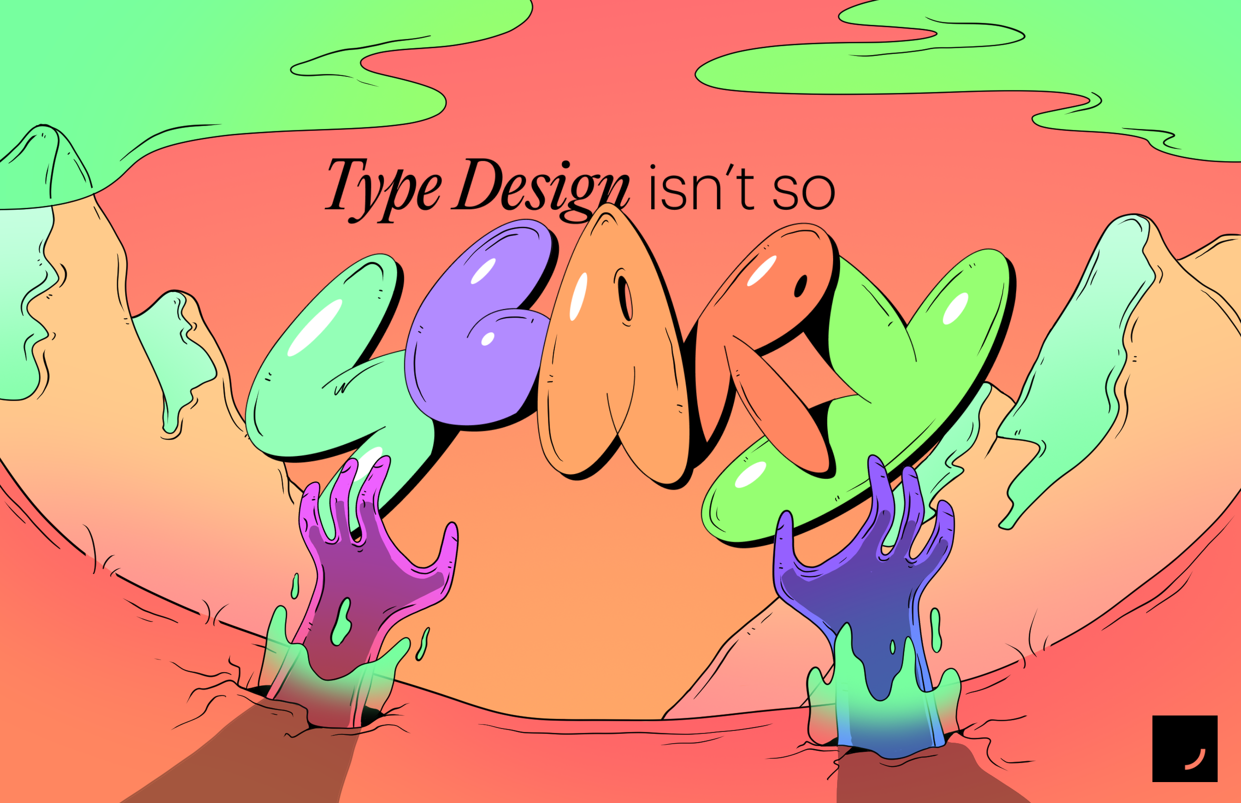
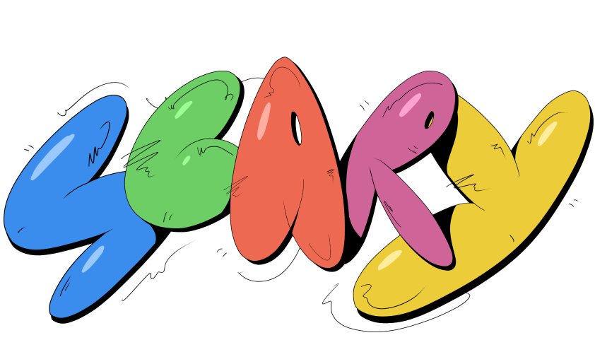
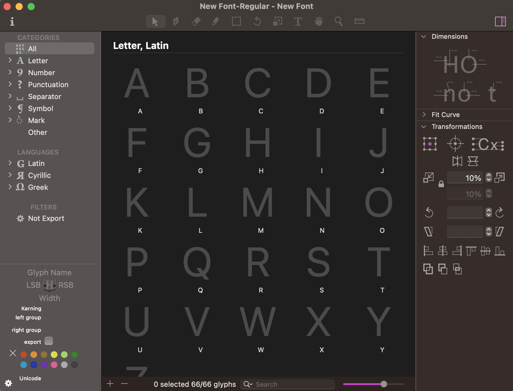
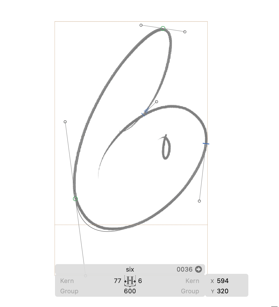
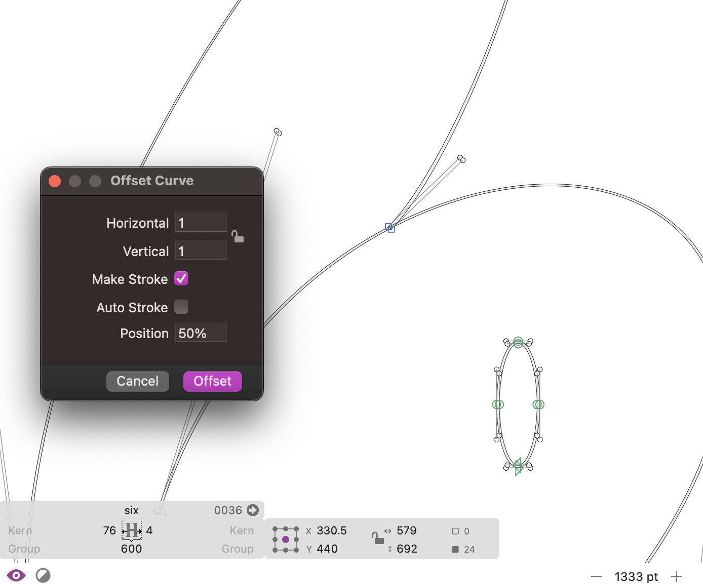
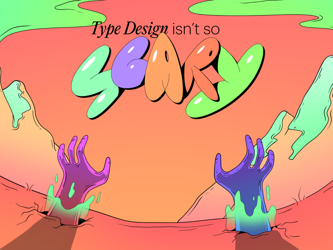



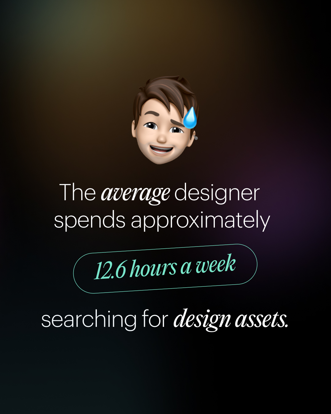

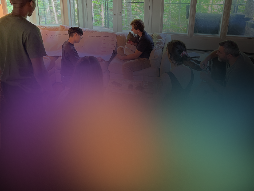
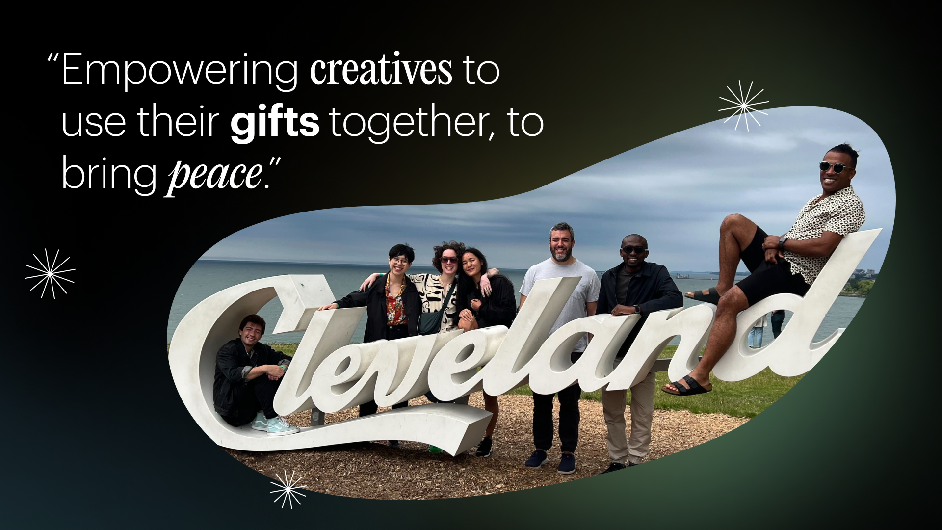





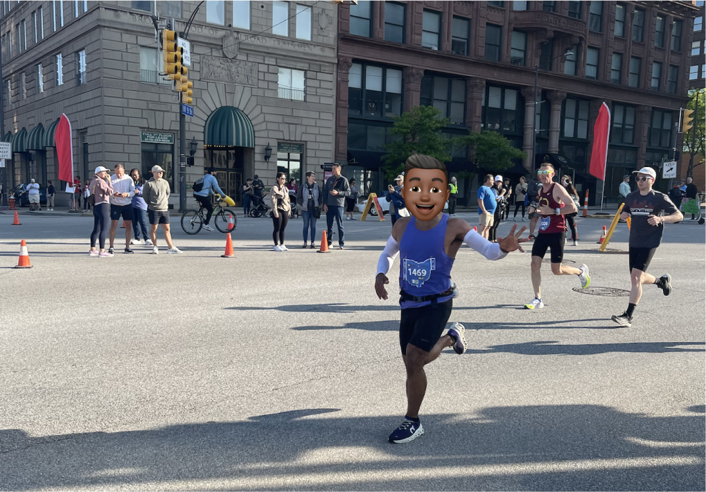


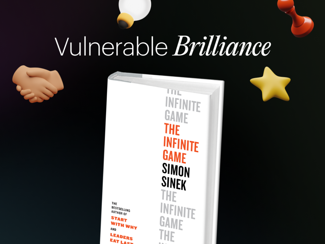


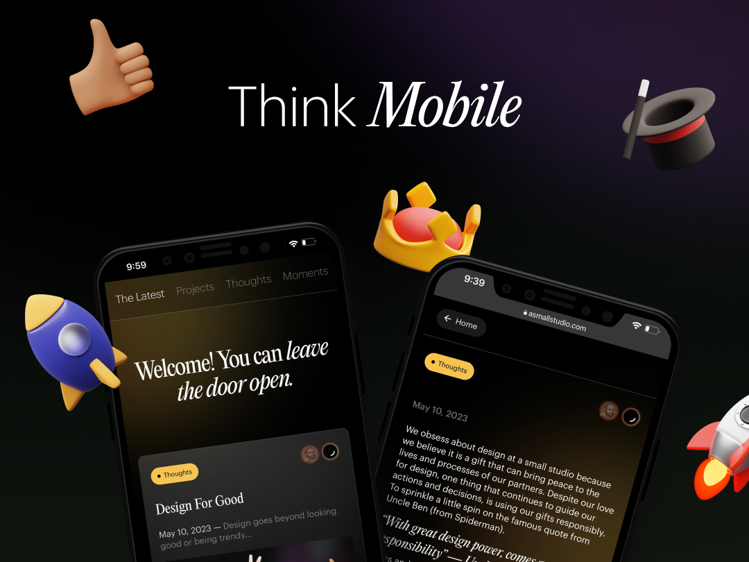


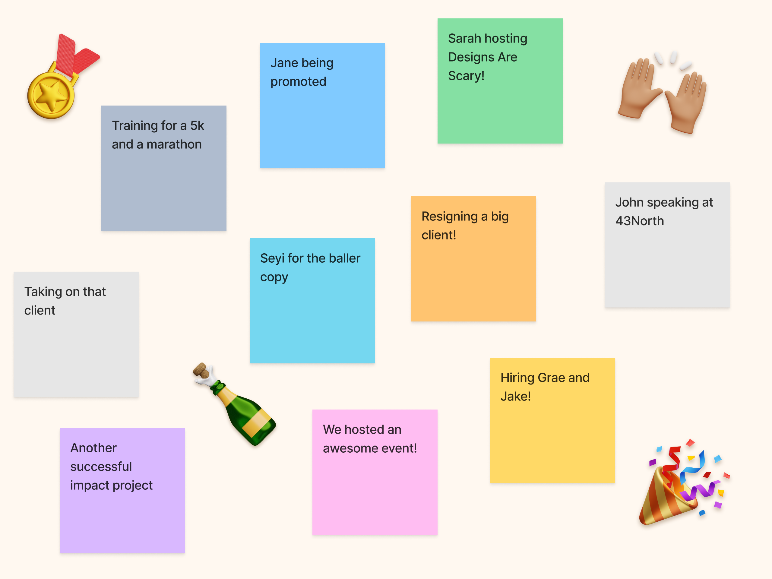
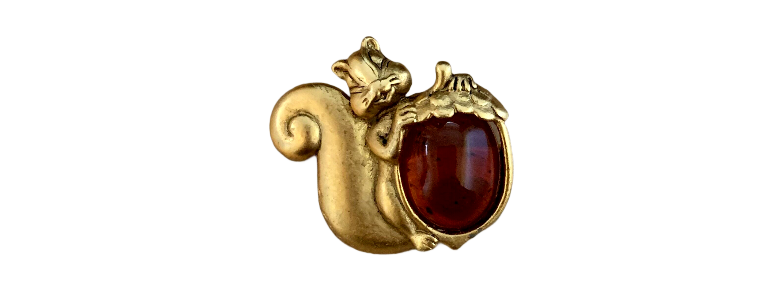
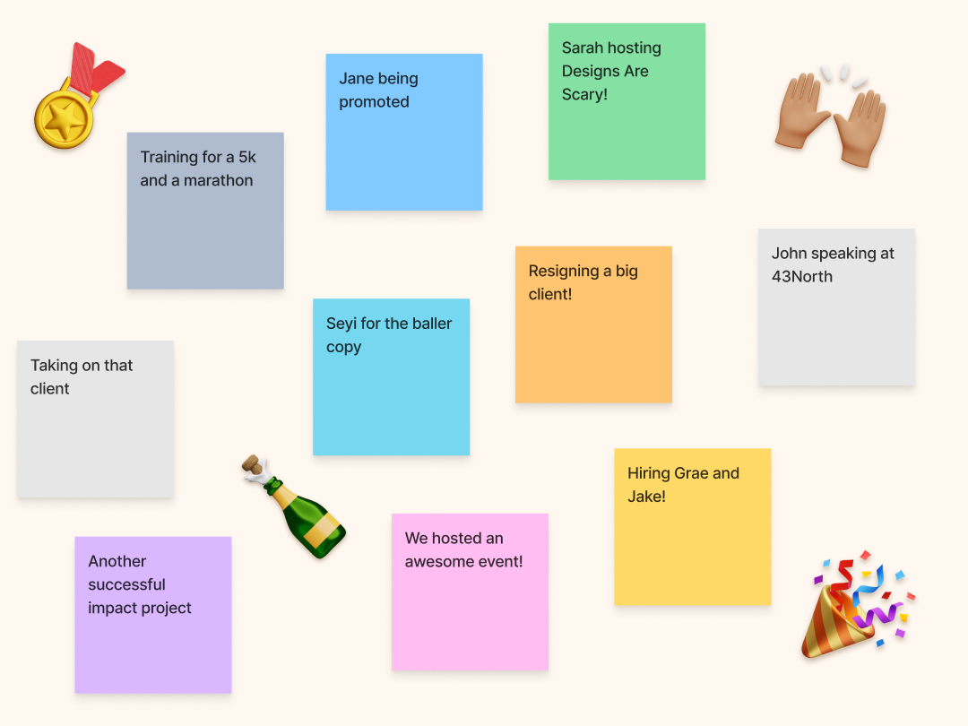


.gif)