Some Creatives have been carrying a particular story for a long time. The need for the solitary genius. The artist in the studio at two in the morning, alone with the work, answerable to no one. We gripped that image so hard and for so long that many of us built entire careers around it without stopping to ask whether it was actually serving us or just making a specific kind of suffering feel like a credential.
Ernest Hemingway made the definitive case for it in his 1954 Nobel Prize acceptance speech: writing, at its best, is a lonely life. He had it delivered by proxy, by the way. He was too depressed to travel to Norway. Seven years later, he was dead, and that’s something to have behind the back of all our minds.
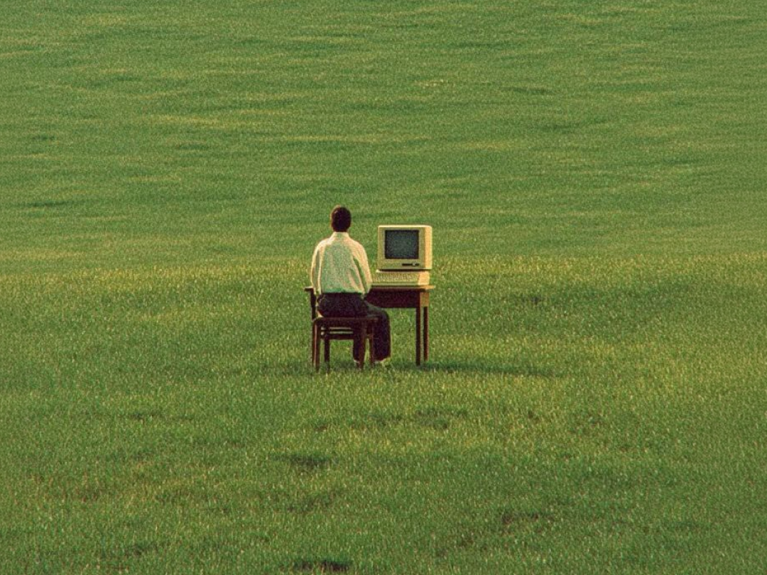
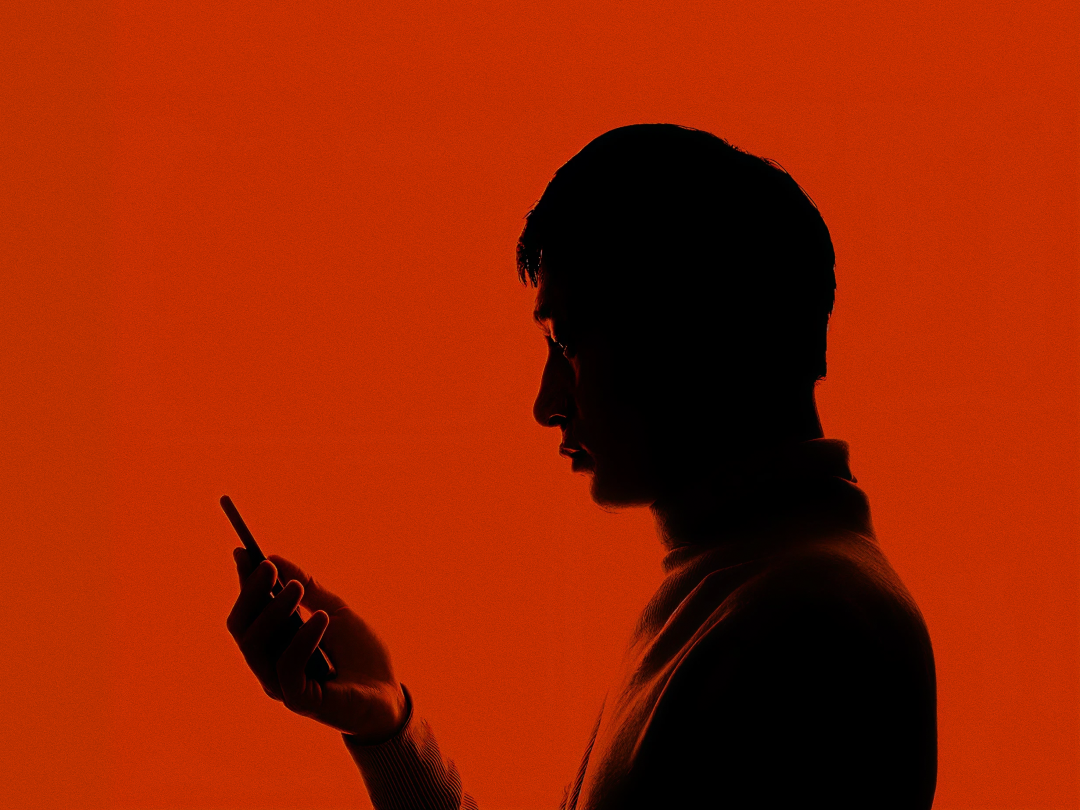
There is a difference between solitude and isolation that rarely gets named, and it matters more for your work than almost any other distinction.
Solitude is the quiet you choose. The uninterrupted morning, walks where the idea finally untangles. Isolation is something else entirely. It is loneliness with no visible exit.
The condition of being cut off from real connection, while the story you tell yourself about independence sounds exactly the same from both sides of the line. By the time you notice you have crossed it, you have usually been on the wrong side for a while.
Psychologists Jean Baker Miller and Irene Stiver described isolation as among the most destructive things a person can experience. Not in the way, obvious suffering is dramatic. More like moisture getting into a foundation; slow, structural. You do not notice the damage until something in the load starts to shift. For creatives, the damage tends to show up in the work first.
When you are genuinely isolated, your inputs narrow without you realizing it. You stop getting friction from people whose brains are wired differently.
The kind of accidental collision of ideas that happens when you are physically near someone thinking differently, that stops. You start circling your own references. The work gets sharper in some respects and less strange in most others. Precise without surprise, and skilled without being particularly yours. It loses something hard to name but easy to feel when it is missing.
Vivek Murthy documented this in his work with enough specificity that it is hard to wave away. Gallup polling found that workers with a genuine friend at work, not a professional acquaintance but someone they could actually be real with, showed measurably higher creative output. Not a marginal difference. Murthy argued that prolonged loneliness keeps the nervous system in a low-grade stress state, and that sustained stress quietly compresses the cognitive functions that creative work relies on most. The ability to hold two contradictory ideas long enough to find what lives between them. Pattern recognition that gets somewhere before the logic catches up. Those do not thrive under chronic isolation. You end up solving narrower problems more efficiently. Which is a real skill, but not the same as doing your best work.
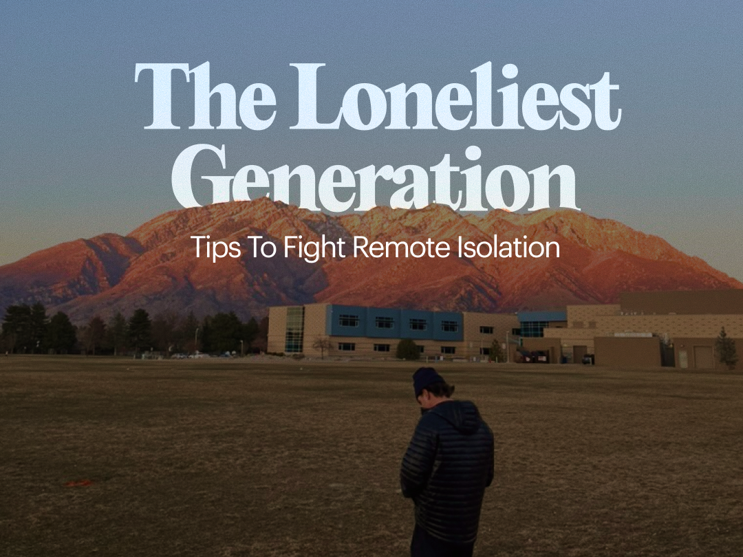
The World Health Organization found that 1 in 6 people worldwide experience persistent loneliness.
Among younger creatives who entered the workforce during the pandemic, started remote, and freelanced or worked in very small teams, it is almost certainly higher. A 2023 survey found that 79% of remote workers aged 18 to 24 reported feeling lonely at work sometimes or often.
The harder problem for creatives is that the industry has developed a real affection for the behaviors that get you there. We respect the person too deeply in a project to surface. We admire the freelancer who answers to no one. We post work at midnight and call it commitment. The look of isolation and the look of serious creative work have been so thoroughly confused with each other that recognizing one from the other, in yourself, requires a degree of honesty most people do not naturally apply to their own calendar.
Who sees your work before it is finished?
The actual work, mid-process, still being figured out, with uncertainties you have not yet resolved. If the answer is no one, that is worth sitting with. Not because work needs an audience at every stage, but because the people who see unfinished things are often the ones who make them what they eventually become. The question from someone who does not know what they are looking at. The colleague who says this is not landing turns out to be right. That is not a disruption to the creative process.
A small studio has operated this way for years, practically, not as a philosophy statement. Radical transparency. Open Office Hours. Vibe Checks that start Monday, not with project status but with how people actually are. One in-person retreat, even a short one, can carry a remote team’s chemistry for six months or longer. Because when people share physical space, something happens that does not happen on a screen, and the trust that comes out of it makes honest conversation about unfinished work possible in a way it otherwise is not.
The loneliness economy is estimated at over $500 billion globally. People are paying for rent-a-friend services. Co-working spaces are selling community memberships instead of desks. Friendship apps with millions of users.
That is a lot of capital chasing a need that, for most creatives, has a less expensive answer: other people.
Not followers or clients. People who know what you are working on before it is done have seen you get something wrong and were there when you tried again.
Solitude may help sharpen you, but isolation costs you. Most people only figure out which one they are in when the bill comes due.







.gif)
